Super So Good Script Exploration
Developing an identity around a script doodle.
Published Oct 24, 2024
Author Austin Barto

It started simply—a set of capital letters, SSG, standing at attention as the first letters of each word in the brand name.
In our early sketches, those three letters, especially the “S”s, naturally wanted to be scripty. There’s a certain flow to them when you see them together—a rhythm. So, we chased it.
“Super” is big, impactful, and impossible to ignore. “Good” is softer but solid. A friendly, positive word everyone instinctively likes. And then there was “So.” A tiny bridge of a word, more functional. It didn’t carry the same weight as “Super” or “Good,” but it had its role to play—contextualizing, amplifying.
As we began sketching, we noticed something remarkable: the “S”s and the “G” shared a visual rhythm. This echo, a natural repetition, immediately gave the design a tight, unified look. It felt right.
I began refining the shapes, pushing that script-like quality further. I imagined these letters flowing together as if written by hand in one continuous motion. The kind of stroke that makes you want to pick up a pen yourself and try.
And then, animation entered the picture. It was subtle but powerful—each “S” looping in, each “G” finishing the stroke. It felt less like a logo and more like a signature, alive with motion. With the animation, the design started to breathe. It was lively but elegant, energetic but not chaotic. The motion made it feel almost personal as if it belonged to someone.
Sometimes, the work resonates with everyone. Other times, the client chooses a different direction. That’s what happened here.
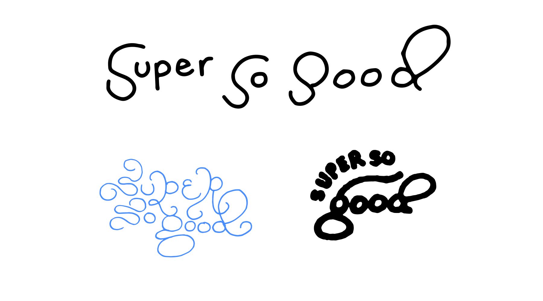
initial sketches which sparked the idea to take it further
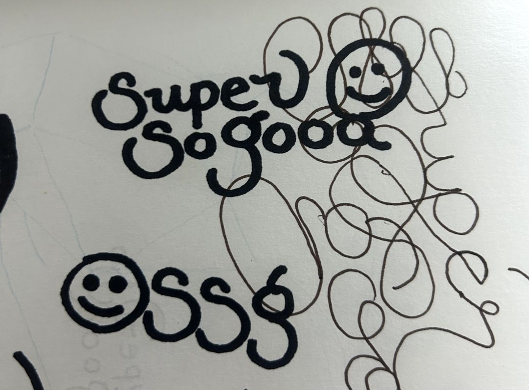
Sketching overtop of other sketches, I quite liked how this felt.
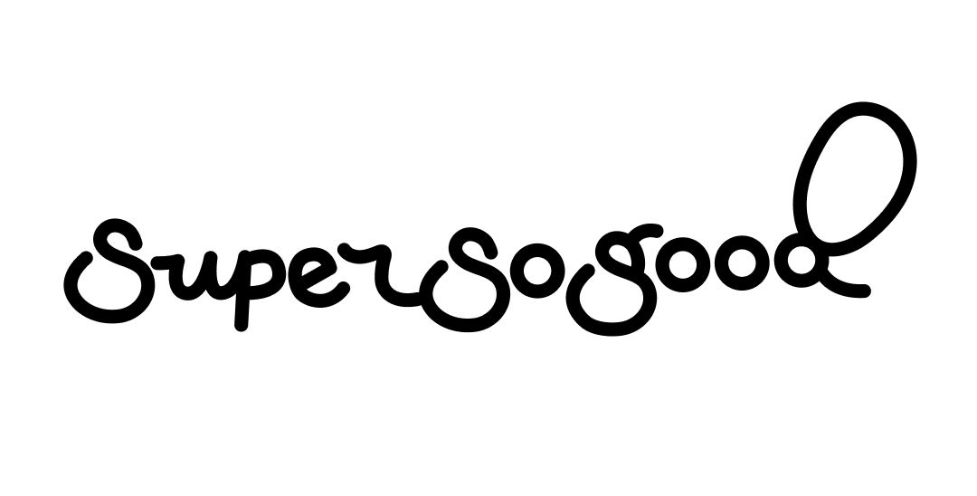
Horizontal version.
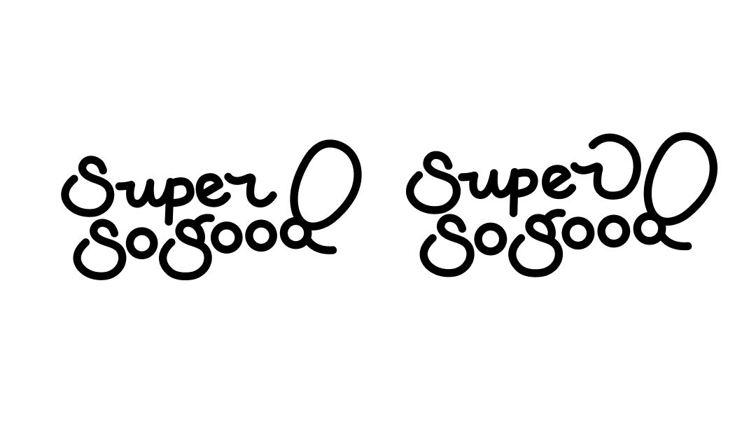
Changing subtle details on the R.
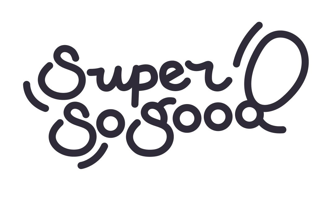
Adding expression lines for more character.
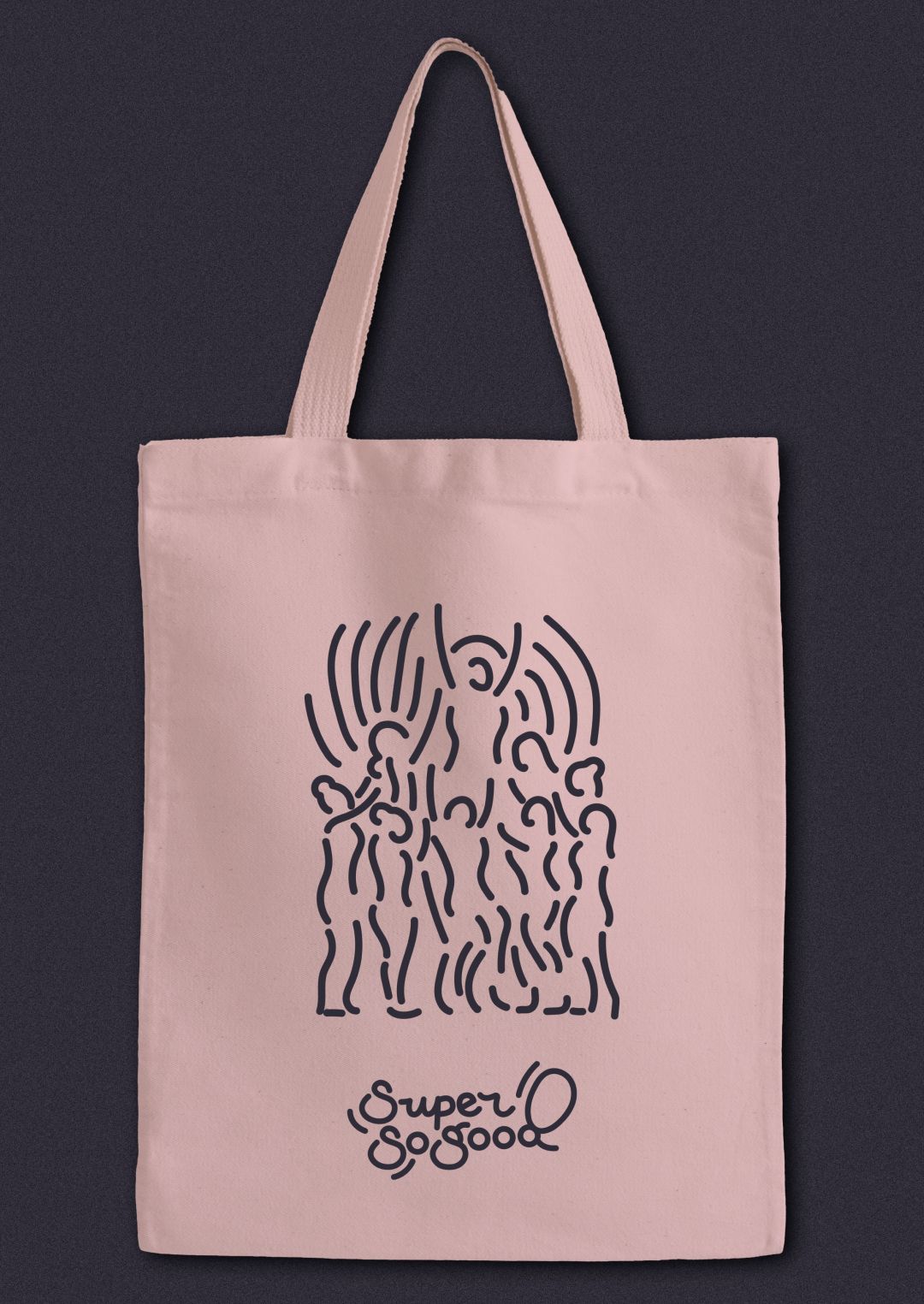
Tote bag.
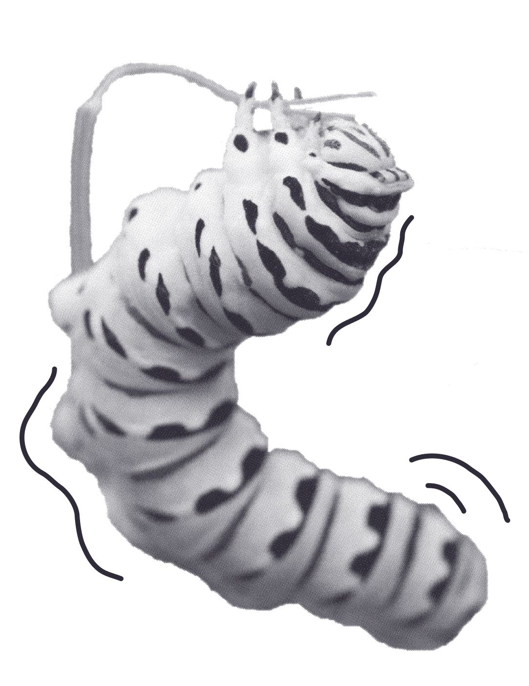
Using expressive lines with imagery.

It is certain.
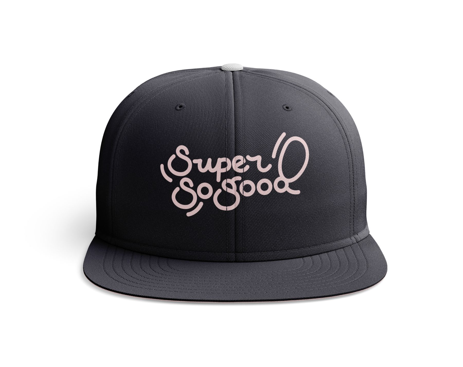
Hat.

Animating to add even more expression!
The project showcases a blend of artistic techniques and branding strategies. It emphasizes the importance of process in achieving a cohesive visual identity.


