Aidem Visual Identity
Standing Against the Bots with Style and Defiance
Published Dec 17, 2024
Author Austin Barto
Branding Aidem was about crafting a rallying cry. Aidem’s mission of combating the inefficiencies and injustices of advertising monopolies required a brand that could stand tall in defiance while remaining approachable, engaging, and—above all—human.
We started with a expansive canvas—five unique directions, all leaning into playful, whimsical, video game-inspired aesthetics. This wasn’t a coincidence. We saw Aidem as a disruptor, a scrappy underdog from the outset. What better language to convey that than the nostalgic, pixelated worlds of 8-bit gaming?
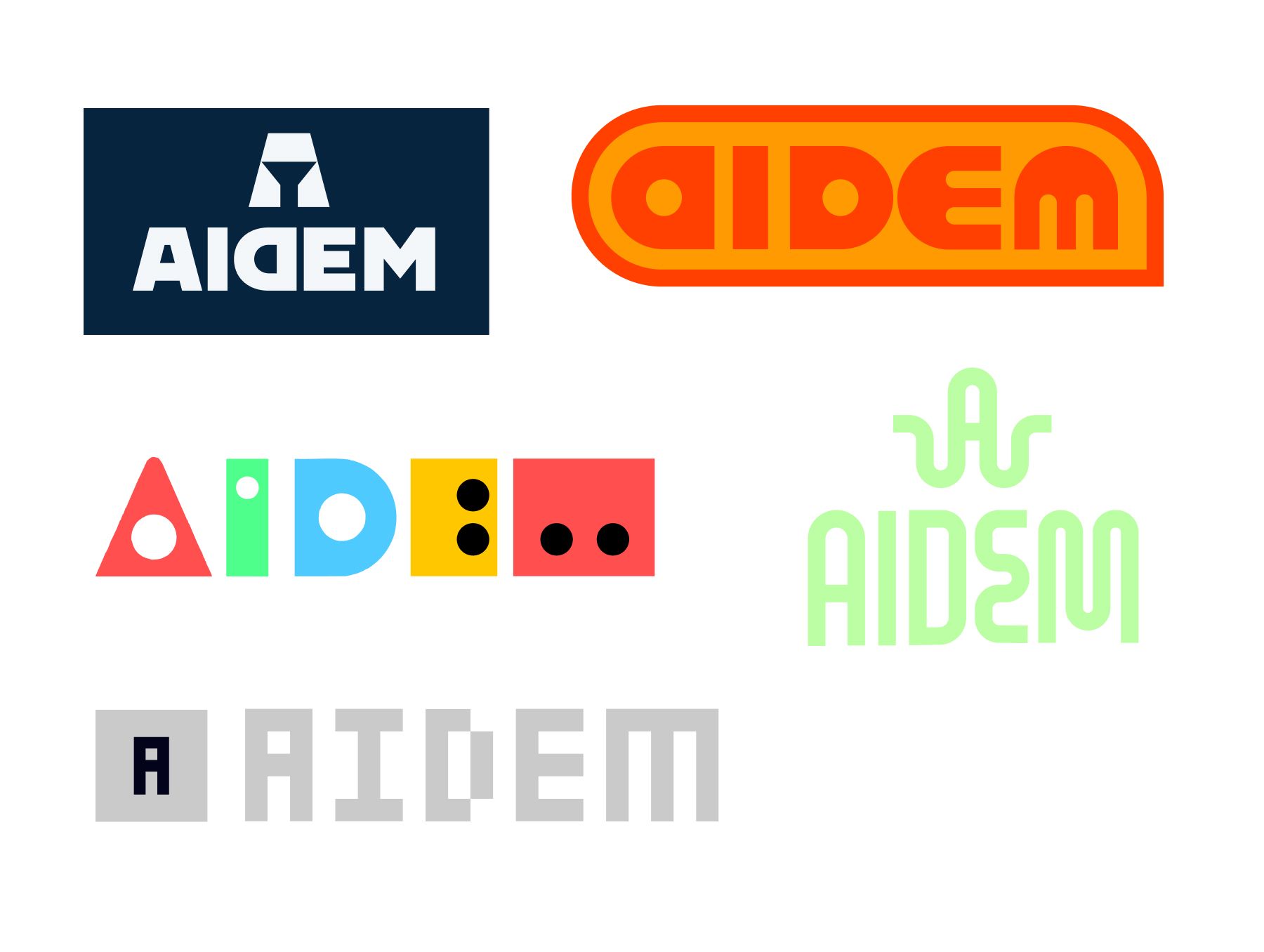
The Nintendo-inspired concept quickly stood out. It felt right. There was something about its simplicity and approachability that resonated not just with us but with Aidem’s team. It was bold without being brash, nostalgic yet fresh. This became the first foundation for the brand’s visual identity.

Positioning them against the noise.
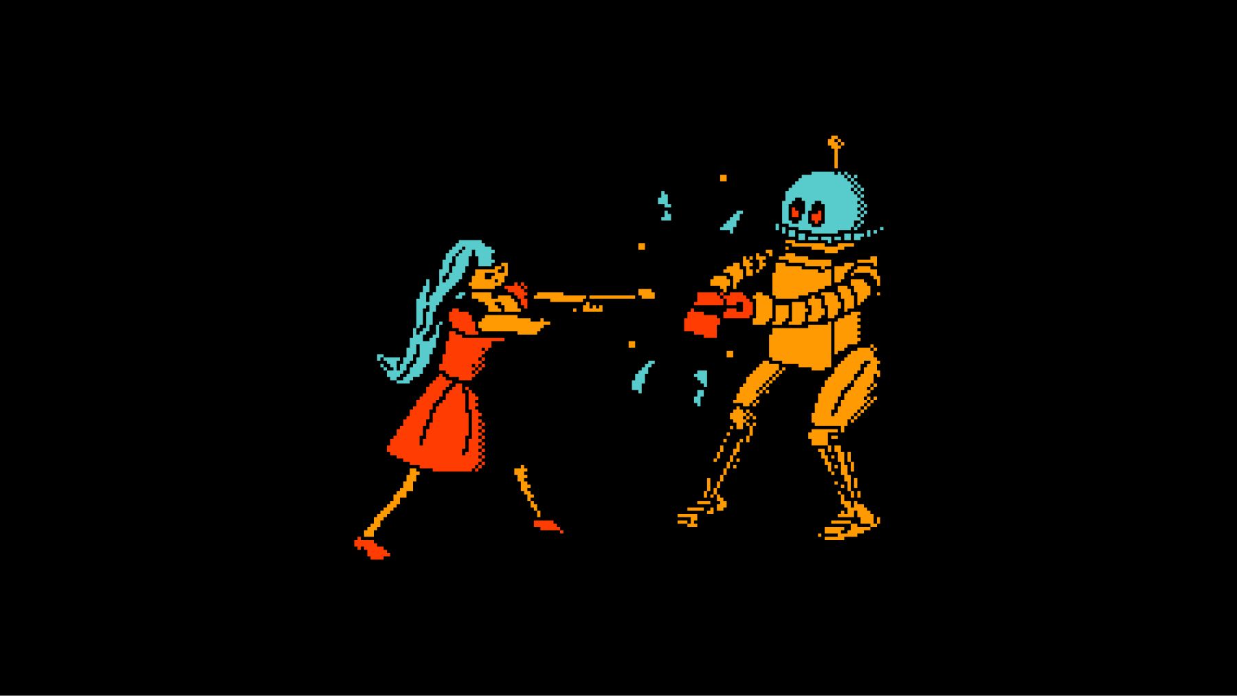
Robots will steal your ad spend
Central to Aidem’s value proposition is its promise to “snuff out the bots”—to ensure advertisers’ budgets aren’t wasted targeting automated programs instead of real people. This idea birthed the Robot Antagonist: a mischievous, money-snatching character. But this wasn’t just a villain for villain’s sake. The robot became a metaphor for everything wrong with the current state of digital advertising—a broken system rigged in favor of monopolies with no incentive to change.

Fraud running rampant.
The Robot antagonist allowed us to create a protagonist, too: a bold, defiant individual standing against the system. Inspired by video game heroes, we designed a character who embodied rebellion and agency, striding confidently past the chaos the bots created. It was about reclaiming power, visually and narratively.

Defiance against the advertisement norm
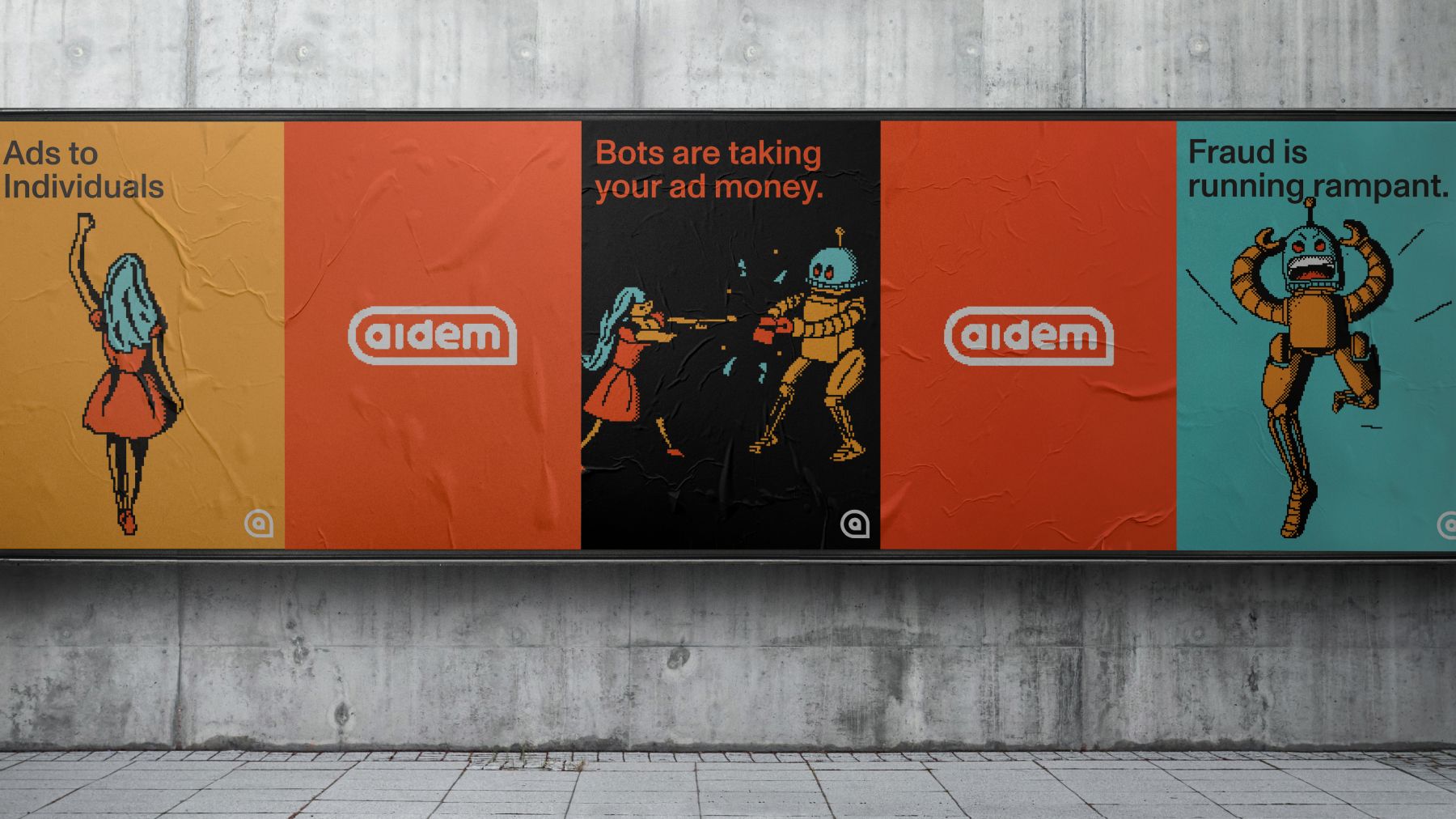
Posters in the wild.
Initially, our designs leaned heavily into the defiant stance—a little too heavily, perhaps. Feedback from Aidem prompted us to recalibrate, dialing down the intensity and focusing on an individual-centric approach. We introduced softer colors, refined illustrations, and pared-back visuals.

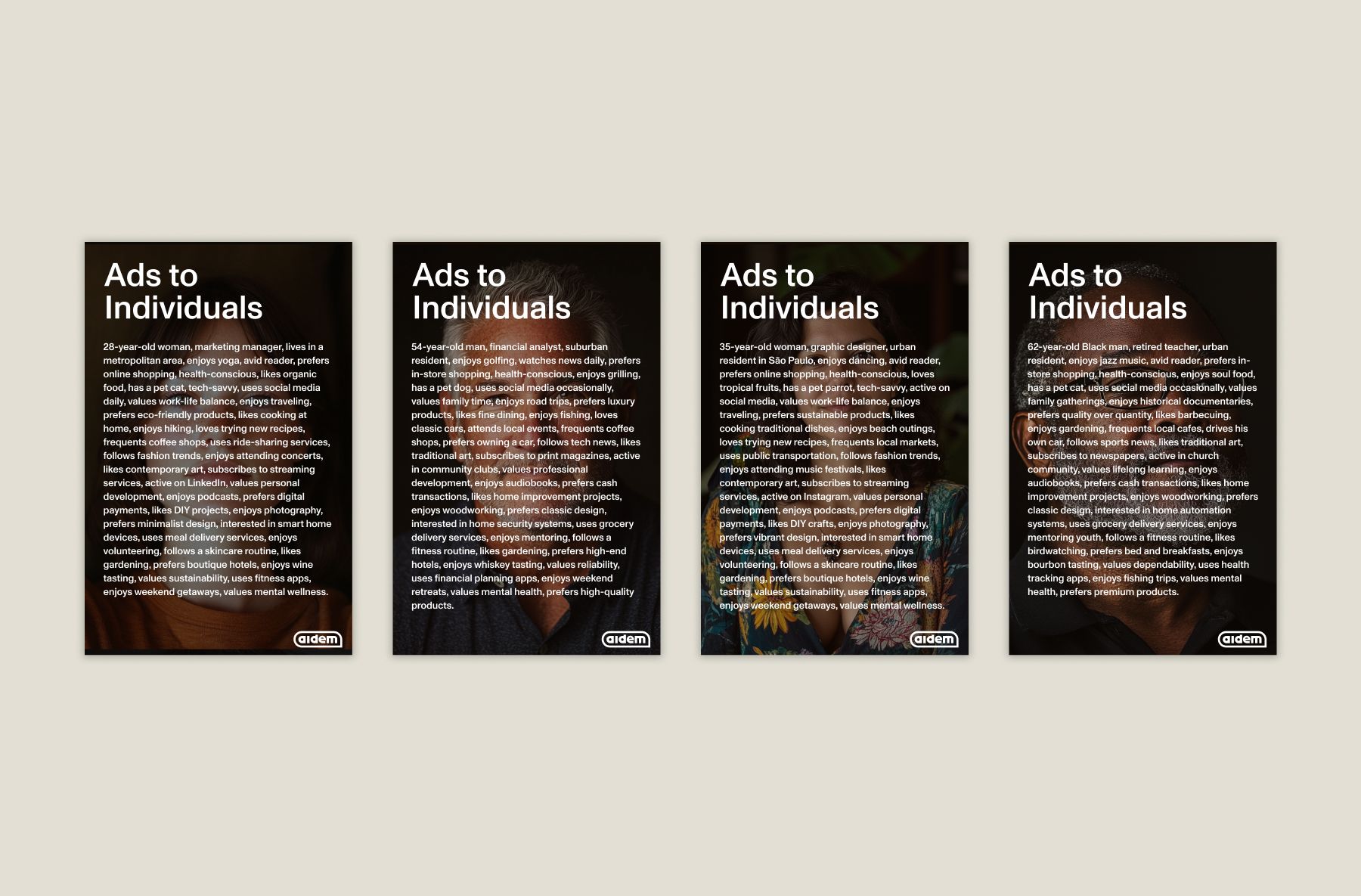
Ads to individuals.
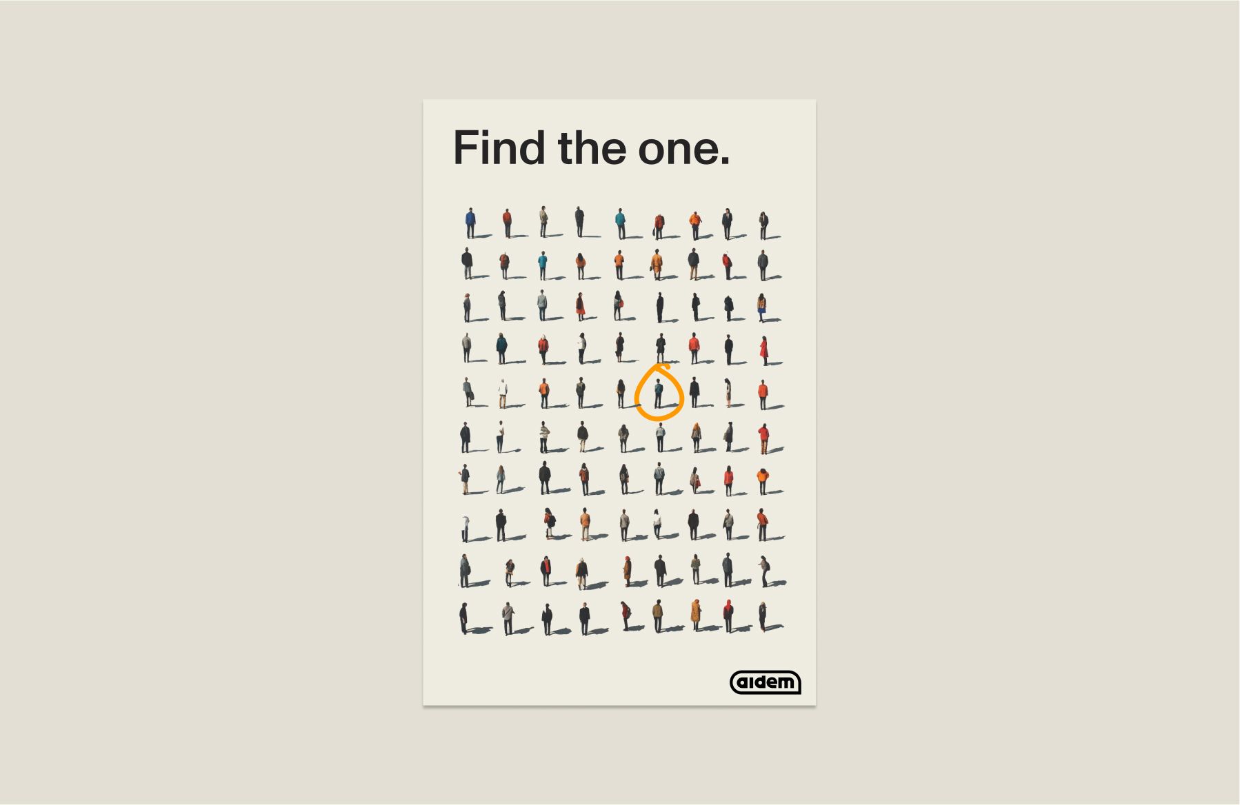
Inspired by Banksy
Ultimately, we brought back the Robot Antagonist and its video game-inspired context—not because it was flashy, but because it was fun. As a young, agile brand, Aidem had the unique ability to stand out visually in a way the established players couldn’t. This wasn’t just branding for today; it was planting a flag for the future.
The animations of bots being “snuffed out” and the heroic protagonist walking in defiance perfectly captured Aidem’s platform and ethos. This wasn’t just a concept; it was an experience. The visuals were dynamic, attention-grabbing, and memorable—something only a new player in the space could dare to pull off.
Final logo
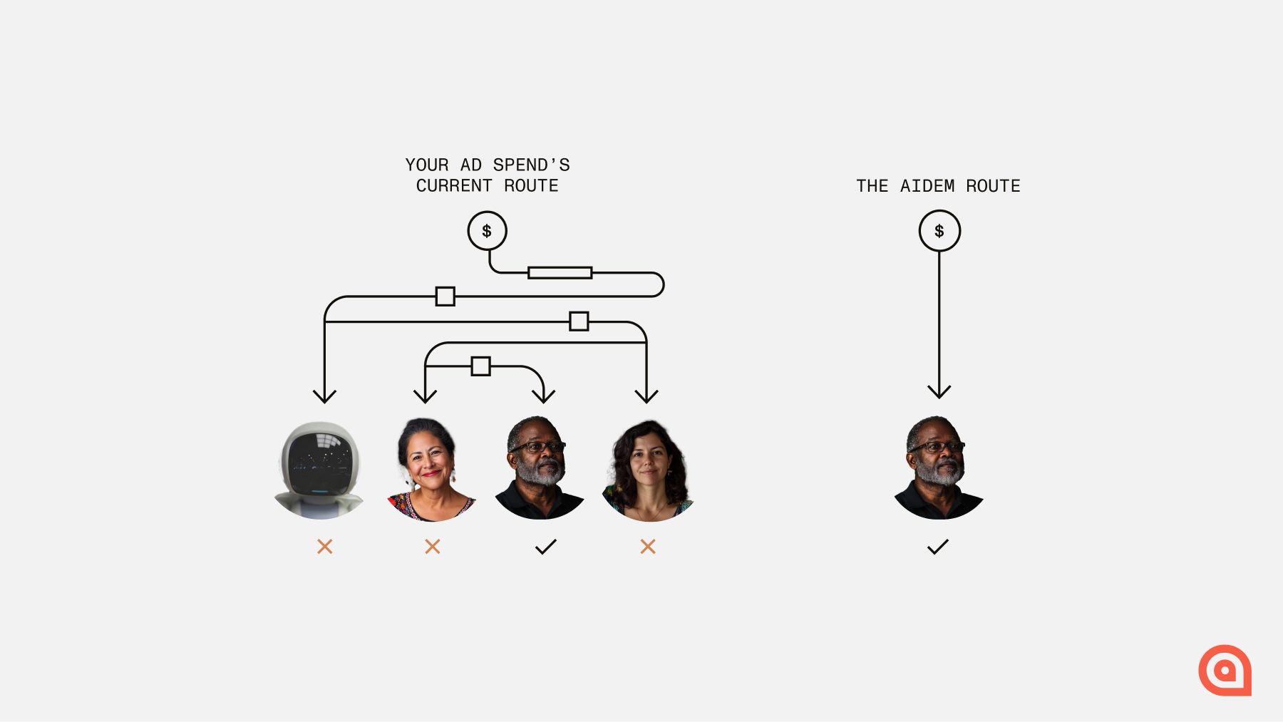
Ad spend route diagram
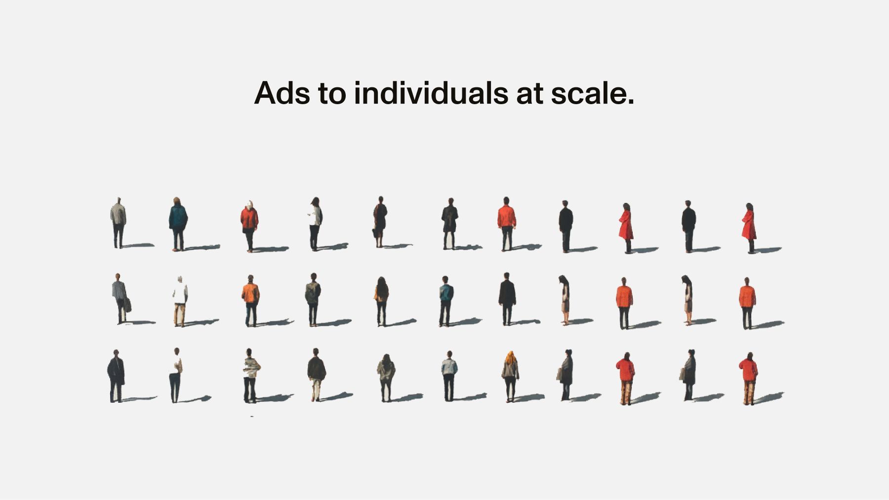
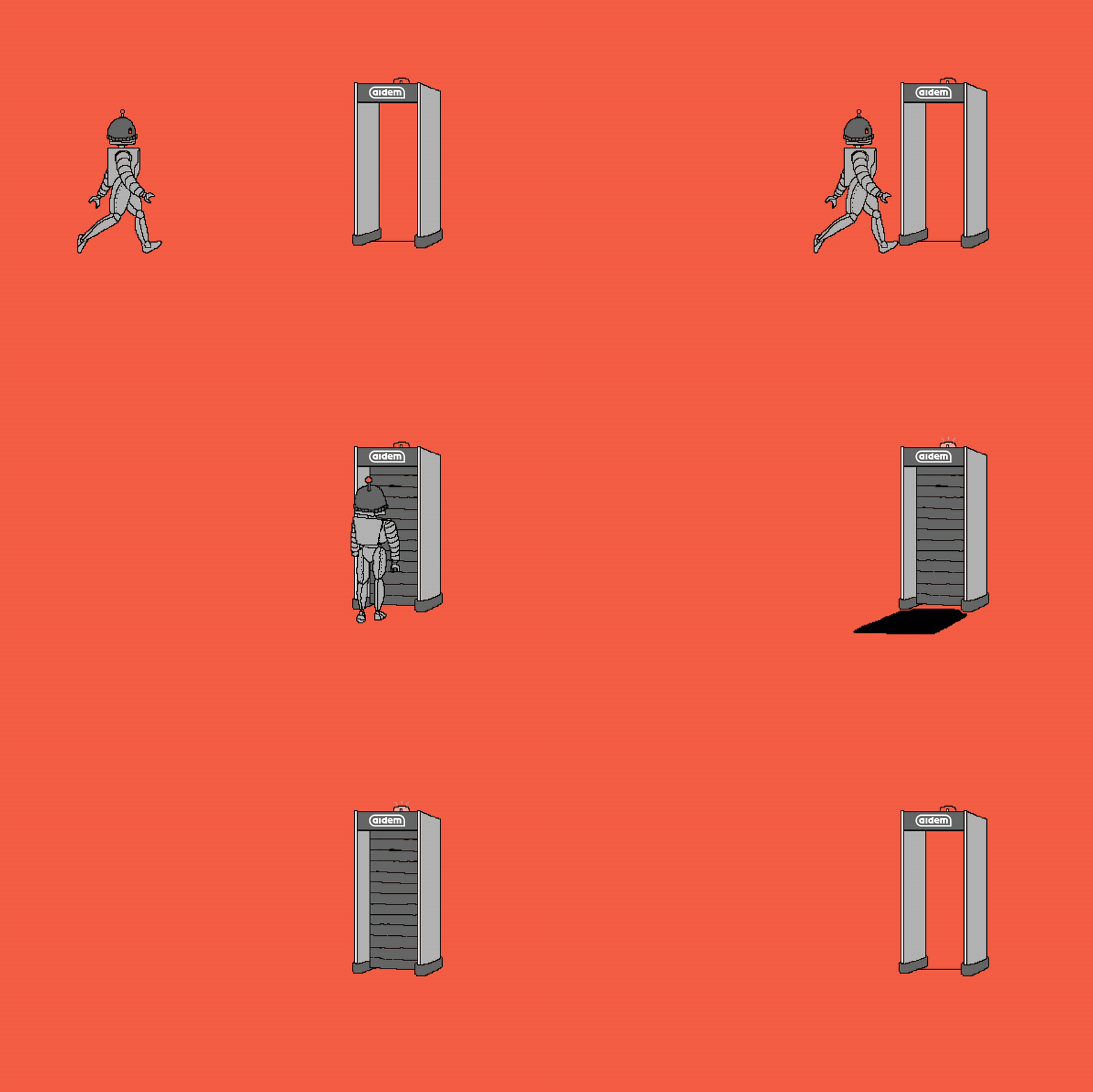
Robot detector
Aidem reminded us that effective branding isn’t just about aesthetics—it’s about aligning the visuals with the mission.
This change affects all instances where the Animation tag was previously used.


