SuperSoGood Identity
Branding a unique approach to funding & capital
Published Dec 14, 2024
Author Austin Barto
When we started working on the SuperSoGood branding project it was an opportunity to shape a visual and emotional identity that resonated with structure and personality.
The Process: Lines, Grids, and a Legacy
The foundation of SuperSoGood’s brand identity began with exploration—a phase where we developed an extensive range of design marks. From scripted elegance to geometric precision, the challenge was to refine these into something that embodied the owner’s vision and her personal story.
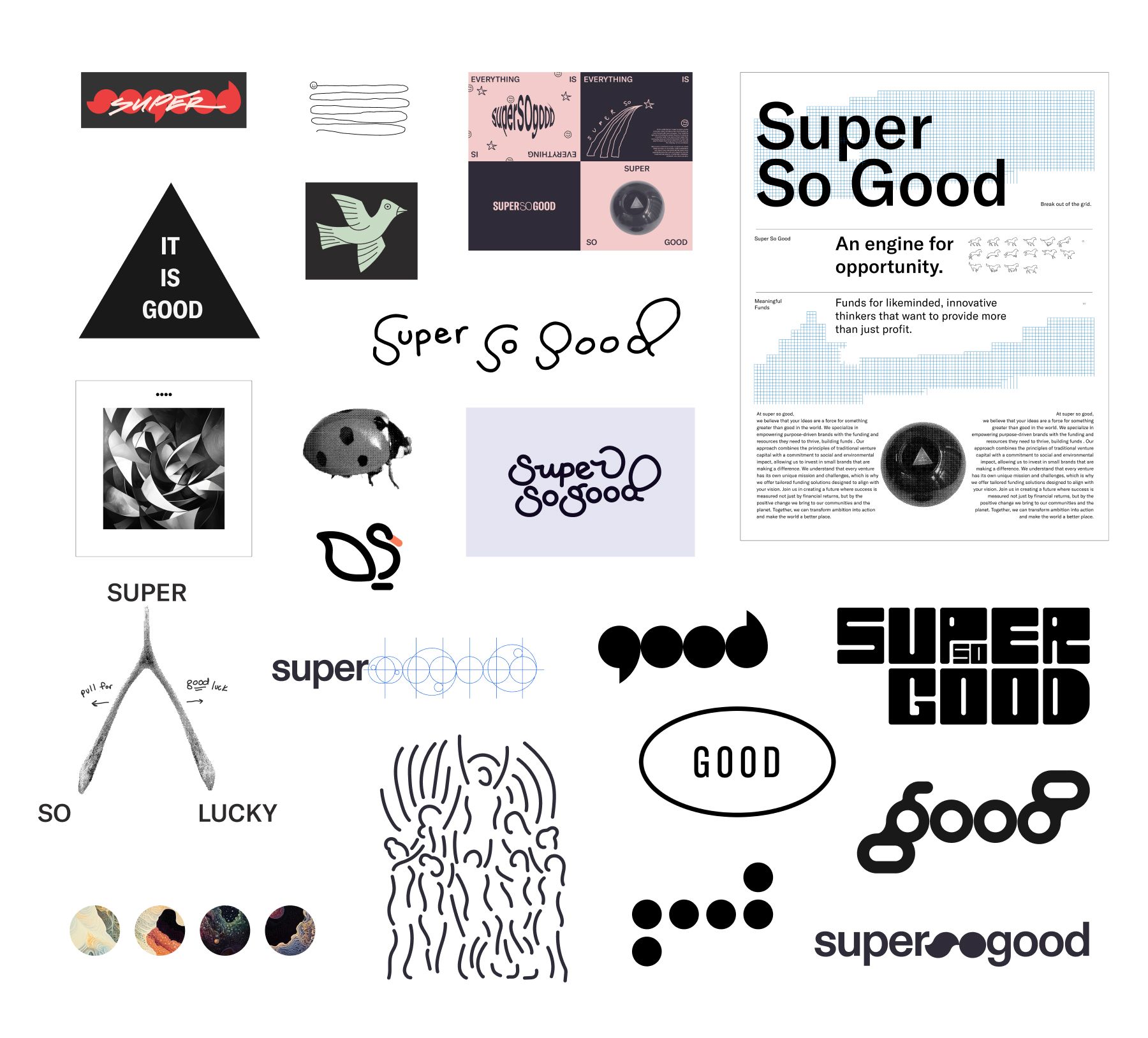
From out initial work we expanded really on two ideas: a script wordmark versus a more geometrical abstract one.
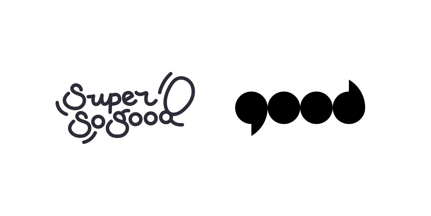
One element stood out during these discussions: architectural lines. This wasn’t just a visual preference; it was deeply personal. The founder’s father, an architect, influenced her appreciation for structure, integrity, and thoughtful design. This connection inspired us to highlight architectural principles in her brand.
We leaned into the draftsmanship metaphor, using “photo blue” tones—a nod to blueprints and the creative process behind the polished results. These early drafts, often overlooked in branding, became a vital part of the storytelling. From there, the design evolved into a geometric identity that felt robust yet inviting.
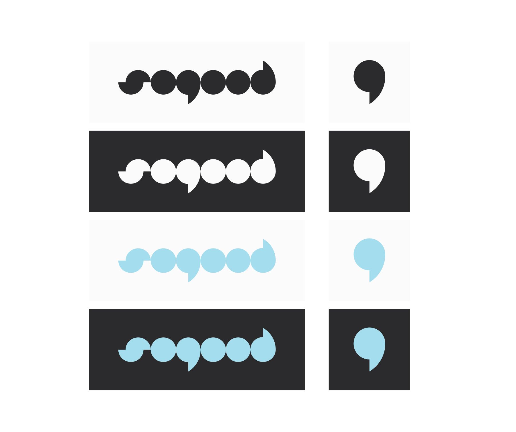
Limited color palette, using non-photo blue as a nod to graph paper and drafting.


The Magic 8-Ball: Playful Execution
SuperSoGood isn’t just about meticulous structure; it’s also about having fun. The founder’s cheeky, slightly snarky personality needed a place in the brand. We found this duality in the execution—balancing polished grids with playful elements like the Magic 8-Ball concept.
The Magic 8-Ball mark became a centerpiece of the brand’s playful side. Its message, “It is certain,” perfectly captured the brand’s confident yet approachable voice. Not only was this a fun visual, but the founder plans to turn it into custom, tangible artifacts—Magic 8-Balls she’ll give to prospective clients, solidifying the brand’s witty tone.
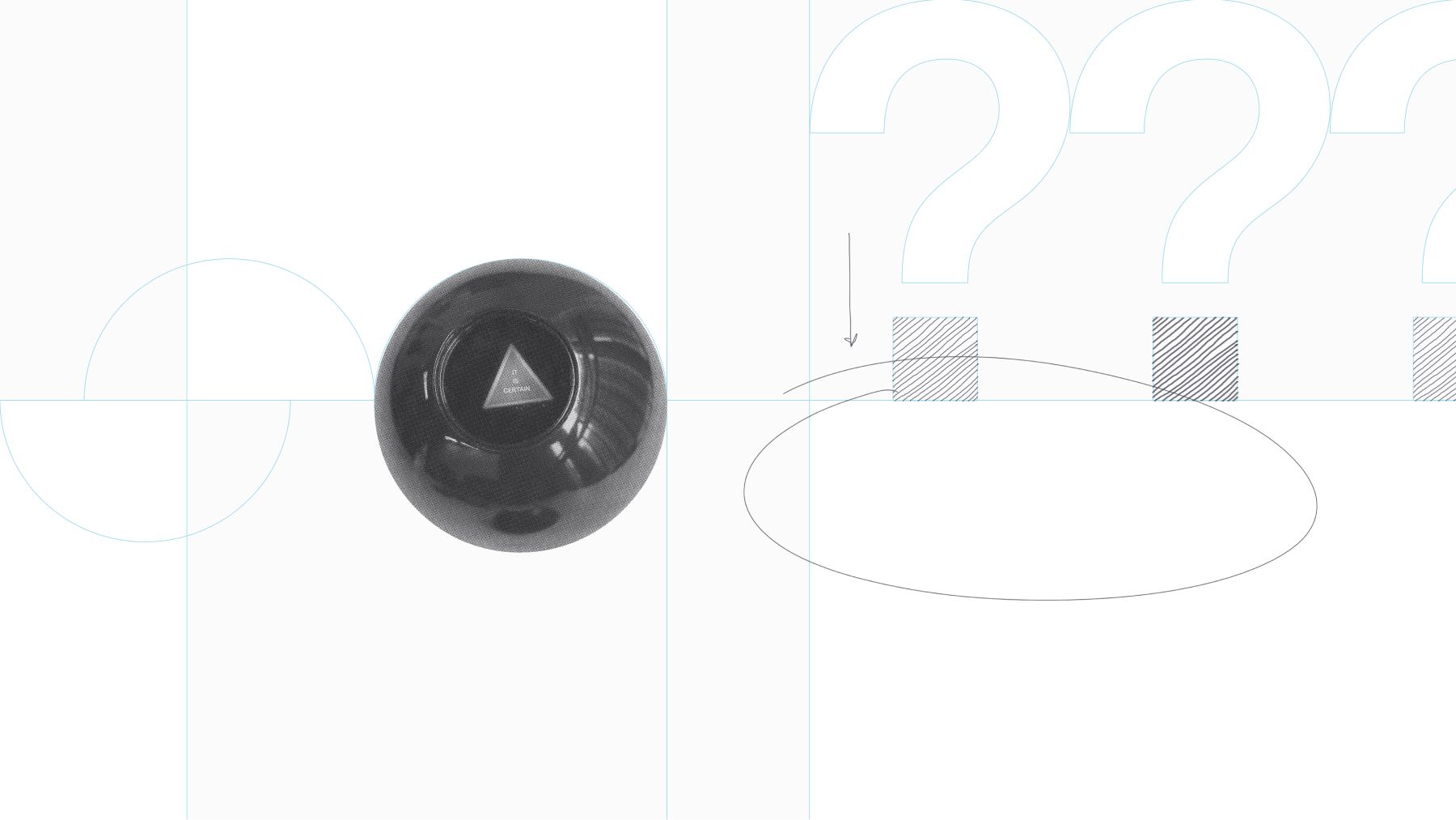
Example slide deck background template.
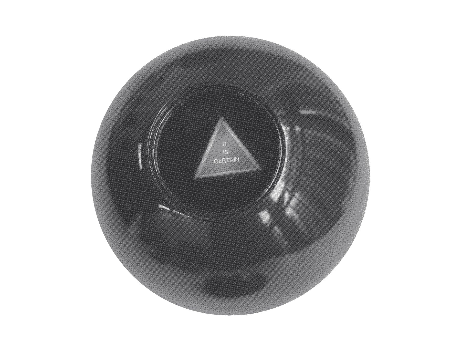
it is certain.
Seeing the Future: Through Glasses and a Dog’s Eye View
The founder often spoke about her role as a visionary for her clients—helping them see opportunities others couldn’t. To bring this to life, we created imagery that resembled a lens or glasses, suggesting clarity and perspective. Her gestures—metaphorically “putting the glasses on someone”—inspired interactive elements for client presentations and marketing materials.
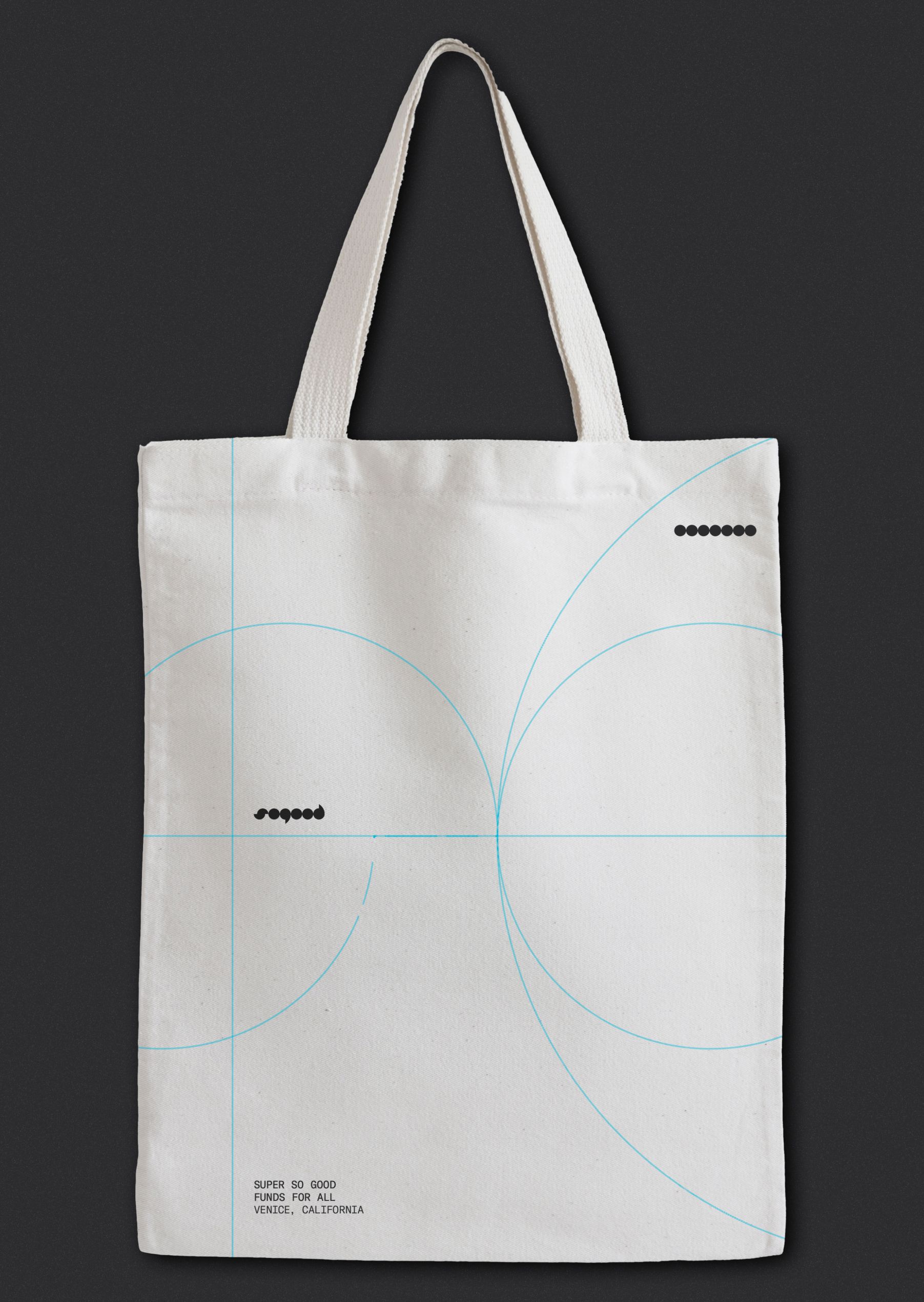
And because every brand should feel personal, we couldn’t forget her love for her dogs. They became playful accents on business cards and tote bags, adding a layer of warmth to her professional but quirky image.
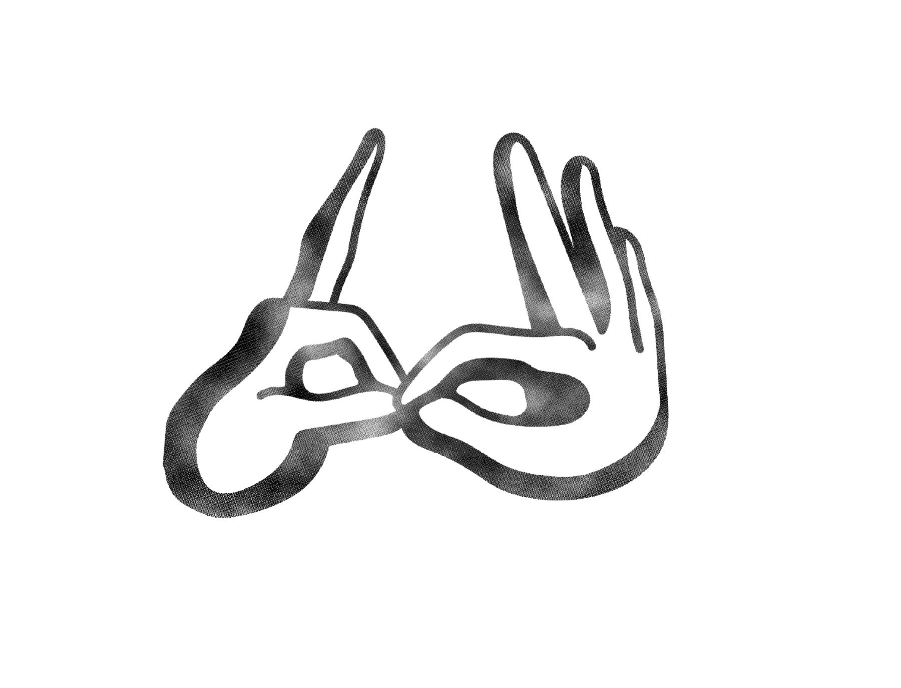
Seeing what others may not!

black cat (consultants)

Friendly dog (Super So Good)
SuperSoGood now has a brand identity that feels both structured and imaginative—a platform solid enough to grow with the founder’s ambitions. From grids to eight balls, from architectural lines to dog-themed tote bags, the brand strikes a balance between precision and personality.
For us, it’s a reminder that the best brands aren’t just designed; they’re thoughtfully built, like great architecture—with a touch of playfulness for good measure.
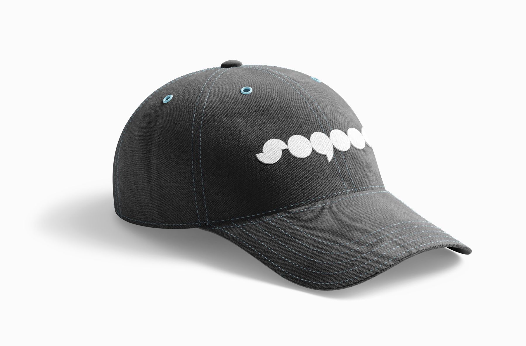
Blue threaded hat.
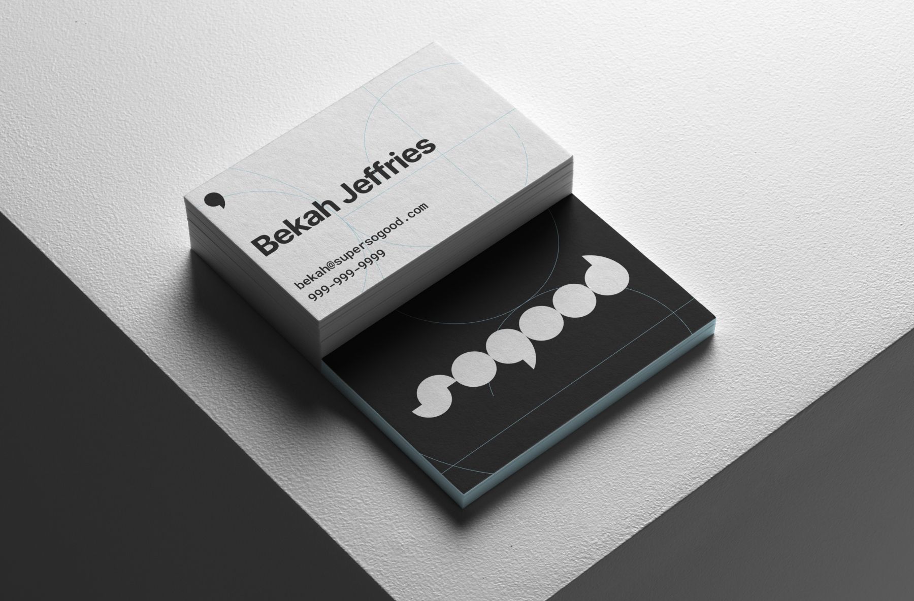
Business Cards
