Reify Branding
Creating a bold innovative brand, for a smart developer-focused marketing organization.
Published Sep 15, 2017
Author Steve Berry
Reify was spearheaded by Mike Bernstein and Brian Doll, of New Relic and Github. Bernstein and I worked together on Code Climate and were already familiar with each other's work flow. Needless to say, I was excited.
Creating a successful brand for Reify, we had to capture the transition from abstract to concrete. A complicated and uncertain task for any design studio.
Their new company is a B2B marketing consulting firm. They help Software as a Service (SaaS) companies productize and market their products. So if you created a SaaS app, and wanted to charge money for it, they would help determine the pricing strategy, tiering of plans, and communication around it.
From an outsider's perspective, the brand strategy they do makes a substantial difference for businesses entering the marketplace. Most of their clients came from personal connections, which meant they didn’t need flashy marketing bullshit and left room to be bolder.
Starting conditions for a branding engagement like this are very important, I sent them over this brand orientation document to set the stage. This document gives the client insight on how our first meeting will go, visual research homework and supporting links that illustrate my perspective branding strategy.
We had our kick-off meeting remotely since Brian is in SF, MRB is in Maryland, and I am in LA. MRB is rocking a serious beard, Brian in his old man garage, and I'm red from surfing in the sun.
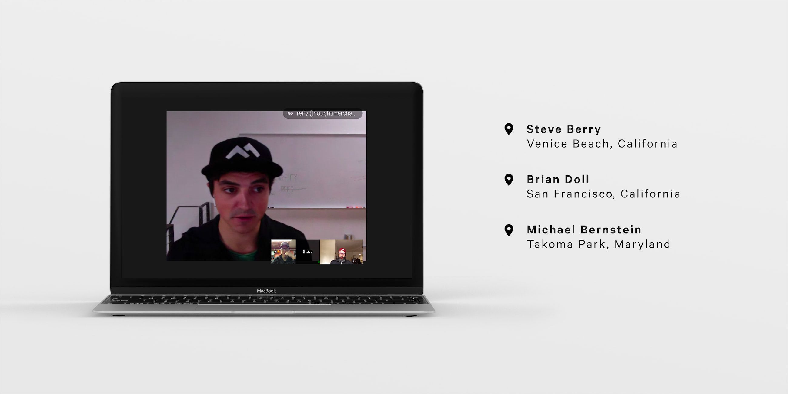
Remote kickoff meeting using Google Hangouts.
For every project, I like to get a feel for what inspires clients. Whether it be logos, paintings, or color schemes, I ask them to send a mood board over featuring clippings of their visual inspiration. Reify delivered an eclectic mix of bold visual styles.
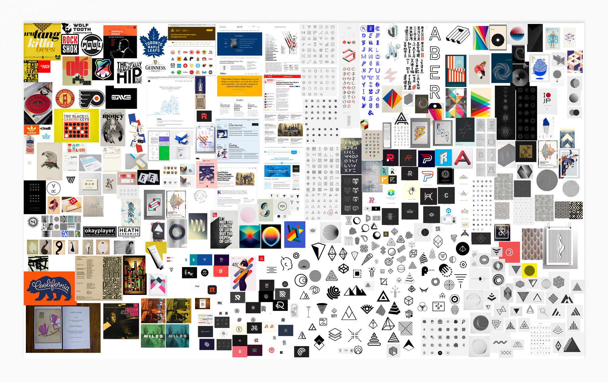
A complete mood board after extensive visual research.
Creating An Icon
Brian and Mike wanted the icon to represent the word's meaning of making something abstract into concrete. Reasonable.
From a simplified, visual standpoint… what do you do? Turn a cloud into a brick? Don’t think so. However, they really wanted to explore that direction, so off I went to the drawing board to see what would shake out. My first thoughts were arrows indicating movement into something solid. Maybe a filter?... pencil?
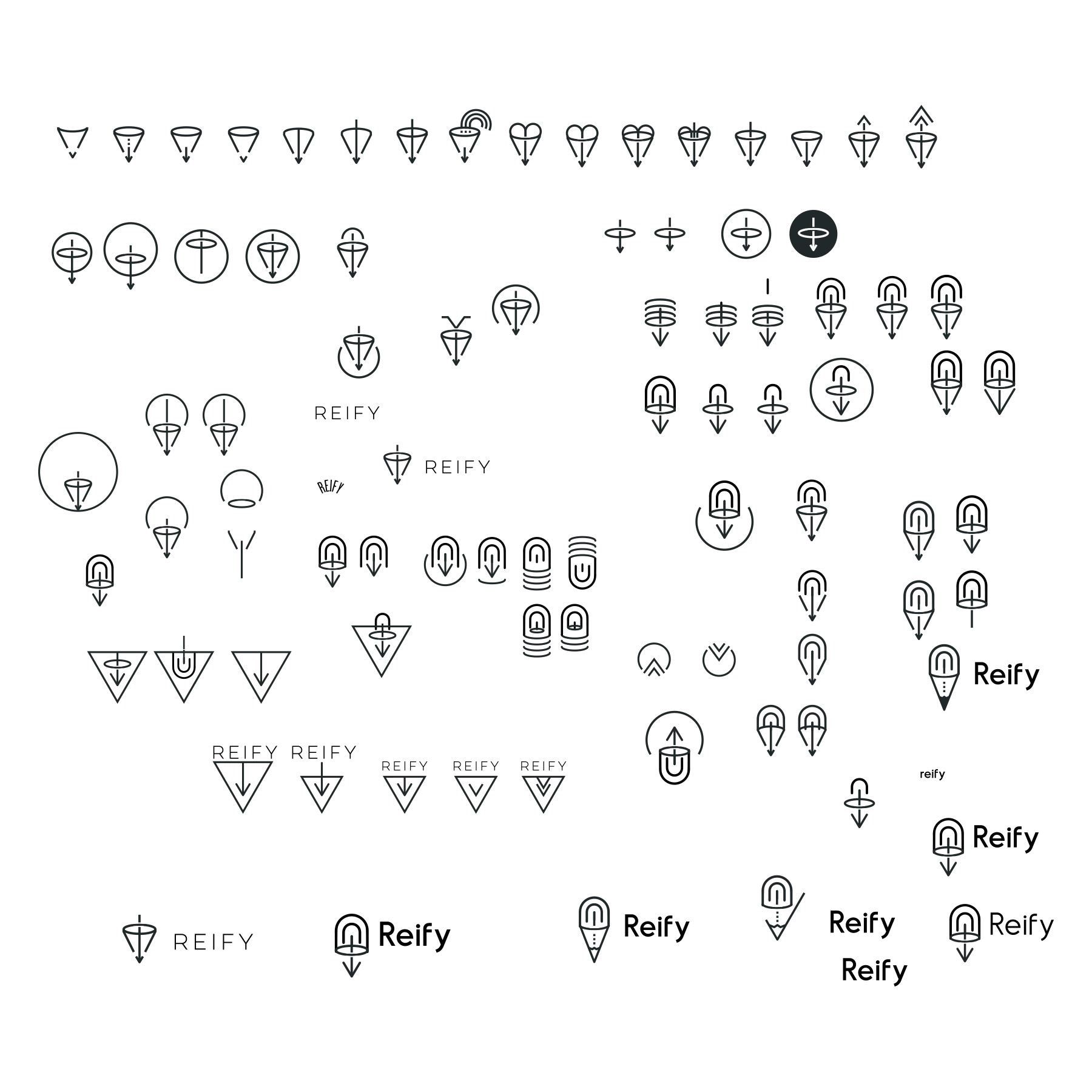
Symbol design exploration.
Or simplified lines and shapes to display transition? I made a handful of attempts at line repetition and shapes to create movement. They ended up looking like thumbprints or worse. Nope.
Although none of the visual solutions worked, we advanced visual discussion and found a typeface I loved.
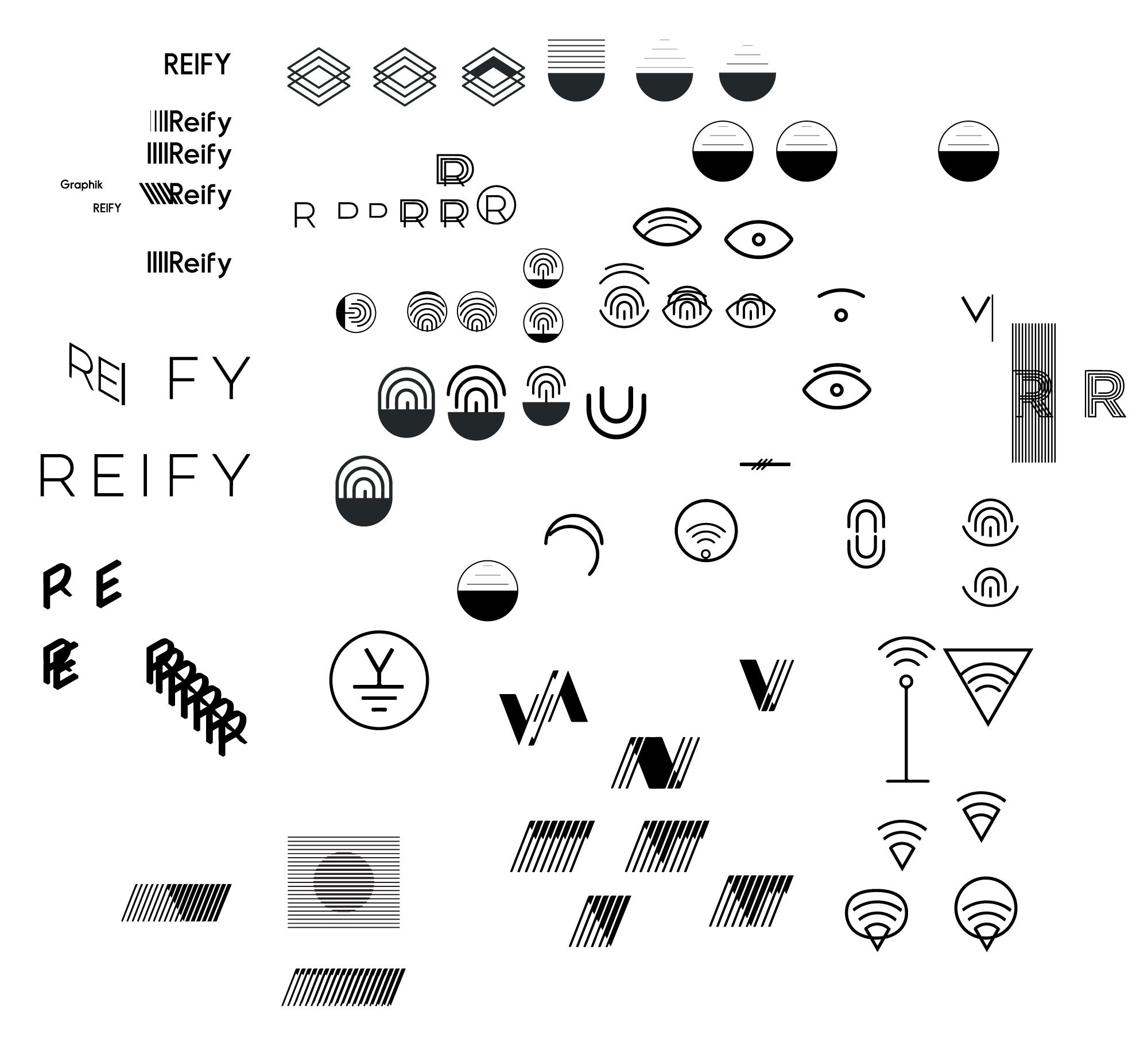
Exploring repetition of lines and shapes.
As you can see, I clearly cannot make an icon that works. However in this round of exploration, I managed to pull an interesting nugget out… Antennas.
Antennas take radio waves and turn them into sound. Antennas are represented by electrical diagram symbols. They aren’t easily distinguishable but we were on to something. Finally, I discovered an interesting and highly recognizable “ground symbol” that would work nicely with the abstract to concrete concept.
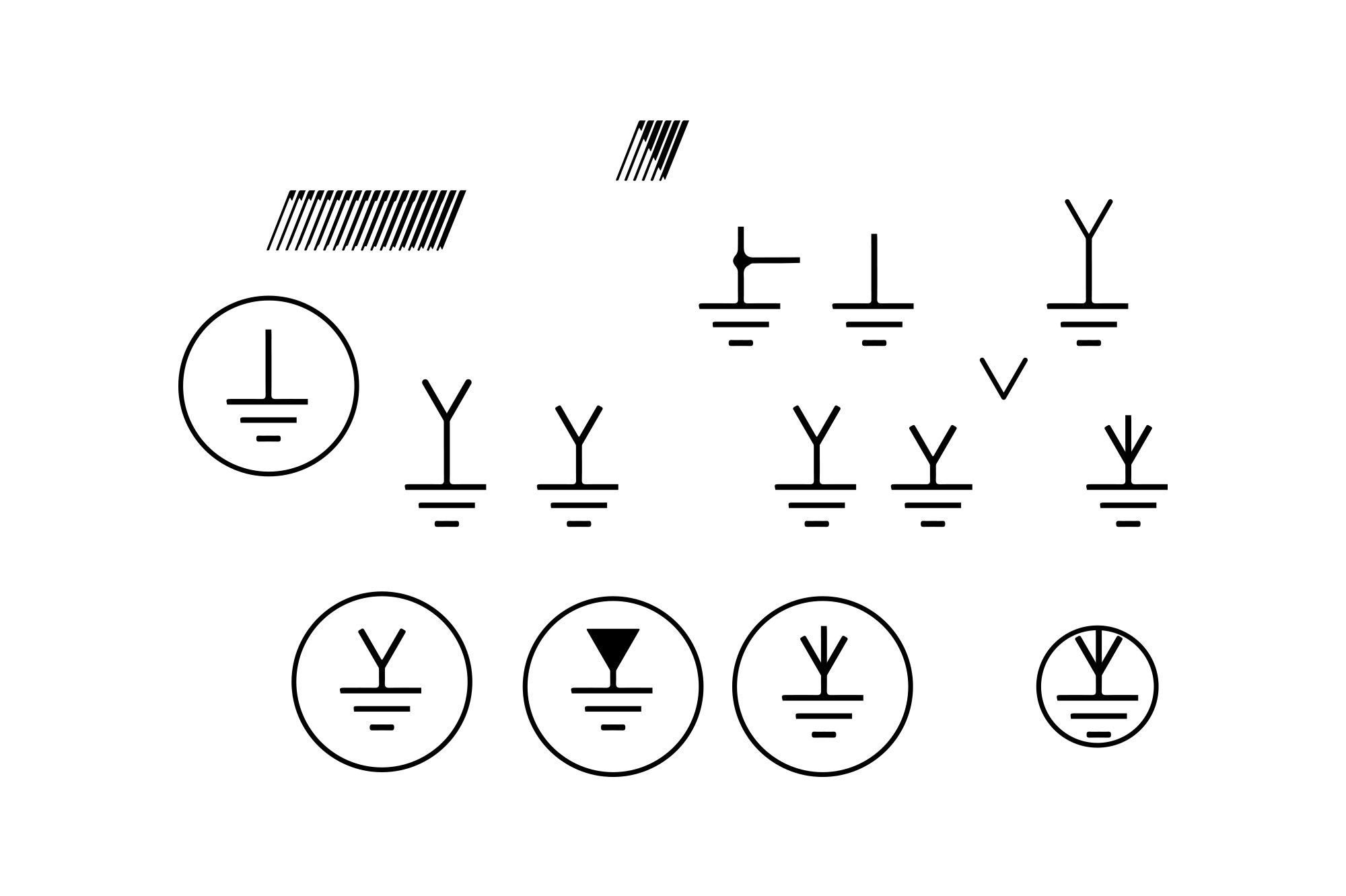
Using electrical diagrams as inspiration.
After refining it, I came across one huge problem… the company already exists. Ground, a men’s handbag company, showcased the same symbol. And to make matters worse, I OWN one of their bags. No wonder why I recognized the logo. Deflating.
Onward we must go, the design process continues.
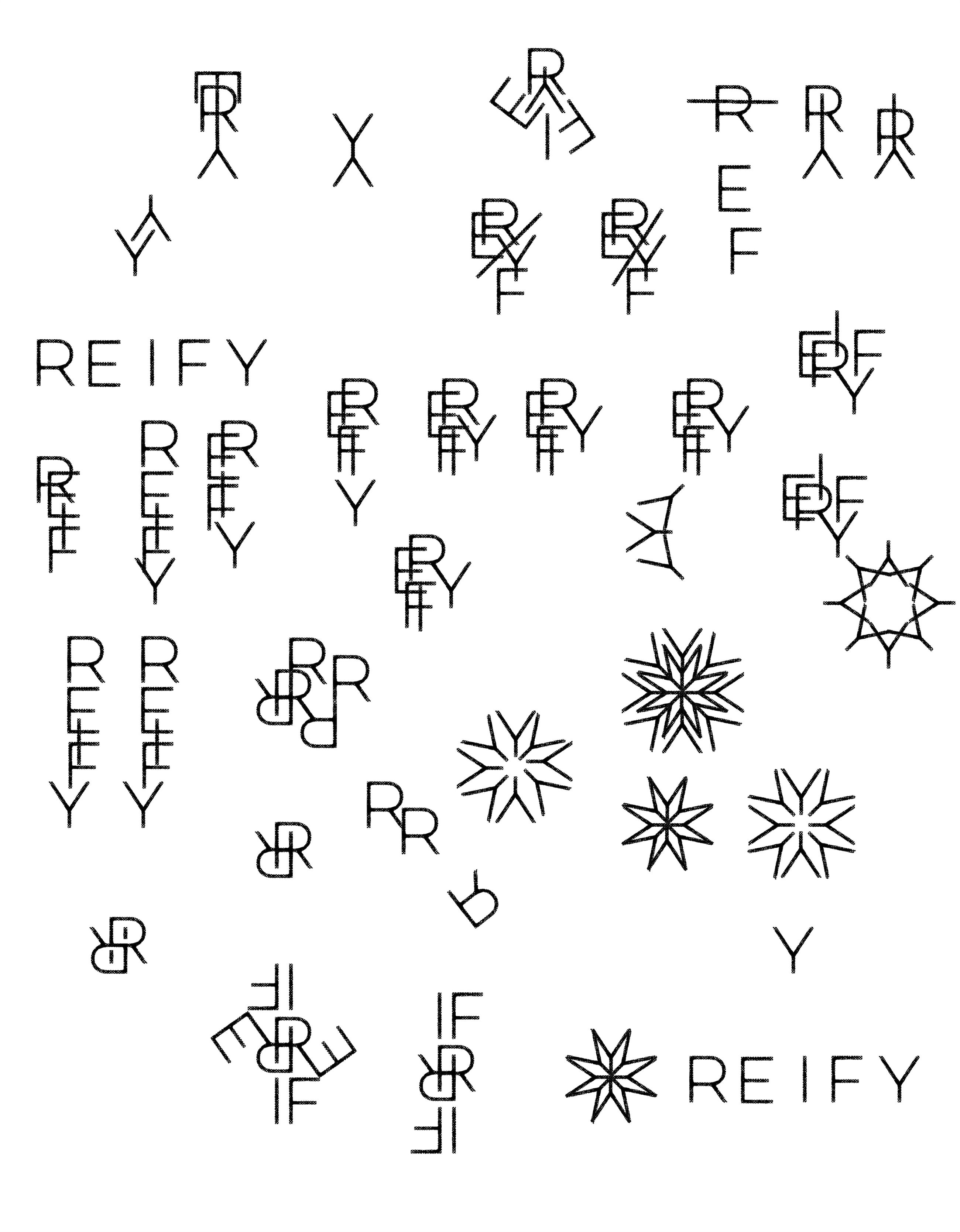
Exploring the repetition of letterforms.
I decided to take to one of my favorite design routes, creating symbols from letters in the typeface. I love the concepts because it always feels right. For Reify, the type did not make good radial symbols outside the “Y”. We rode with it until completion, but the guys weren’t too keen on it. The symbol felt corporate.
The challenge was to figure out what connects the brand story of “taking something abstract into the concrete”.
Making the abstract concrete.
Then it hit me. It could be the antenna! Yes, let’s give this a shot.
I’d been looking to test concentric circles around the Reify “R”, but couldn’t figure out how to connect their story to it. I decided to record my voice saying “reify”, traced the waveform pattern in Adobe Illustrator, then wrapped the waveform around the radial “R.”
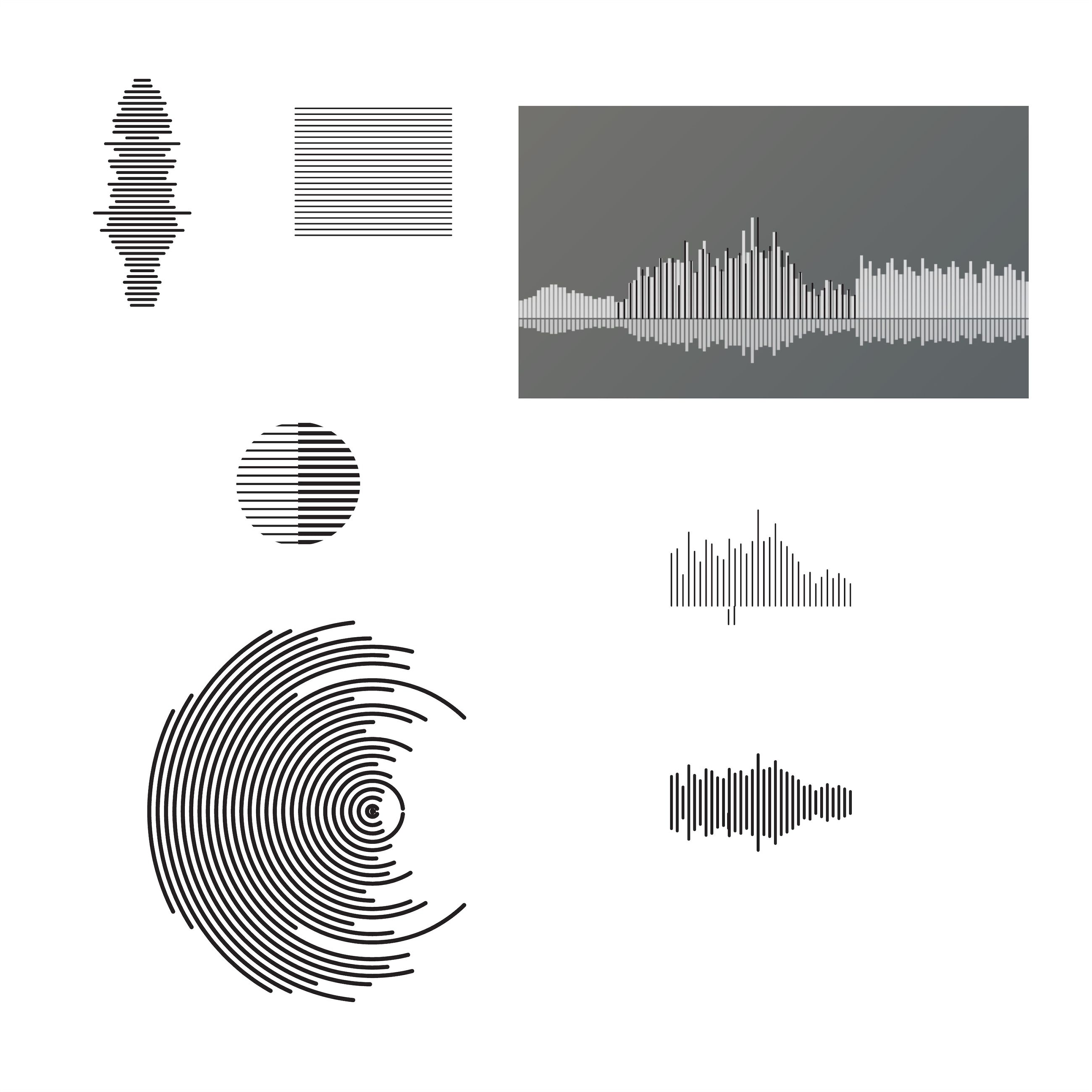
Turning sound into image.
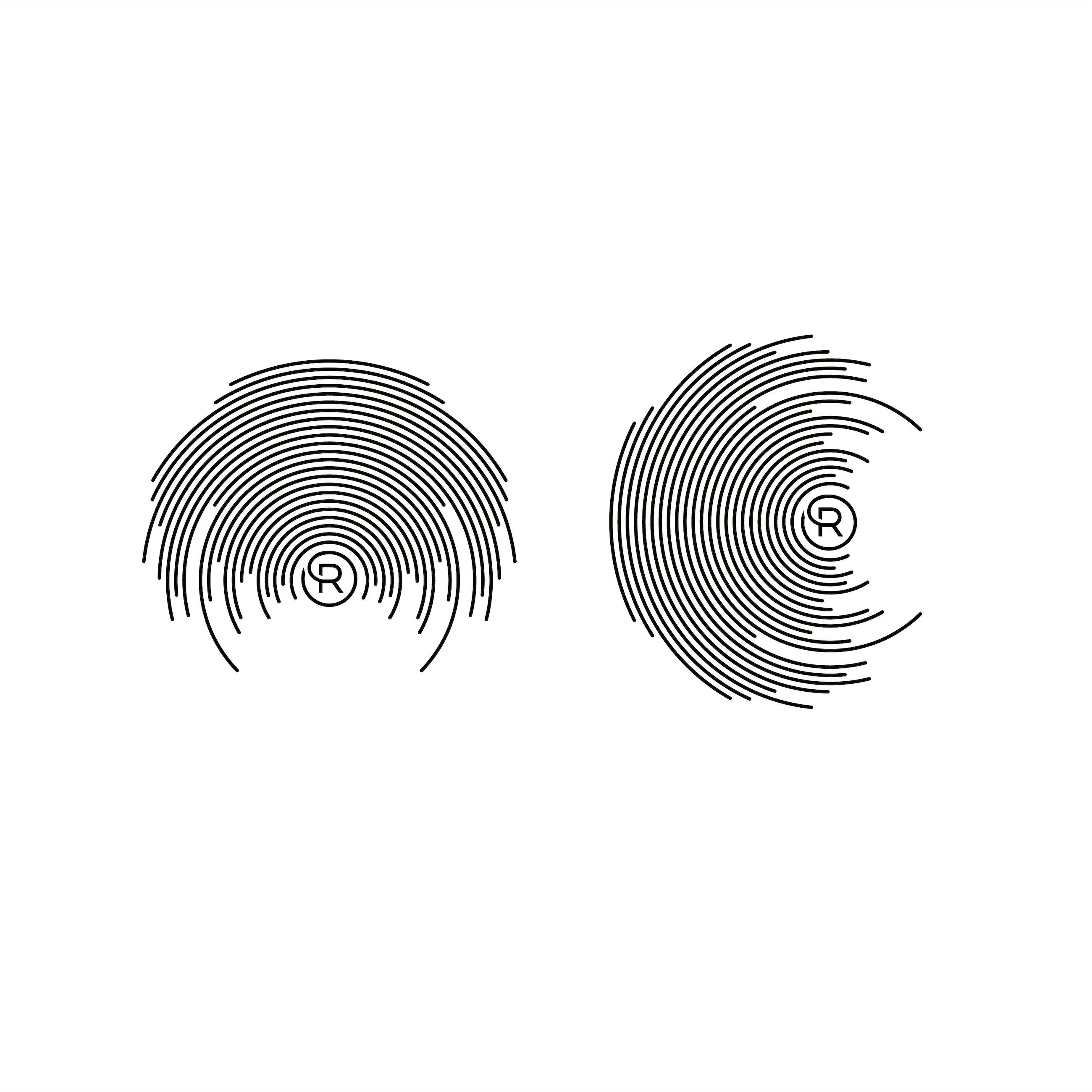
Wrapping the waveform around the R in a radial pattern.
Everyone was excited. We finally nailed the brand image they were looking for, but they wanted the pattern to incorporate into their logo. Tricky, but not impossible.
A complicated pattern is never a logo, so I decided to leverage the waveform but preserve the “R” inside the circle as the mark. I contextualized the waveform concept onto documents they might use to get more buy in, with success. It captured their attention and interests, but they weren’t a fan of the blue. Blue is a safe brand color. That’s why you see all these lame companies with blue branding.
I chose the blue as an ode to one of my heroes, Paul Rand, for his original IBM logo. Reify, similar to IBM, is entering their brand space as experienced hitmen that will get your company “right”. I went darker for Reify to indicate seriousness. Given their edge on the market and client base, blue was too corporate for Reify.
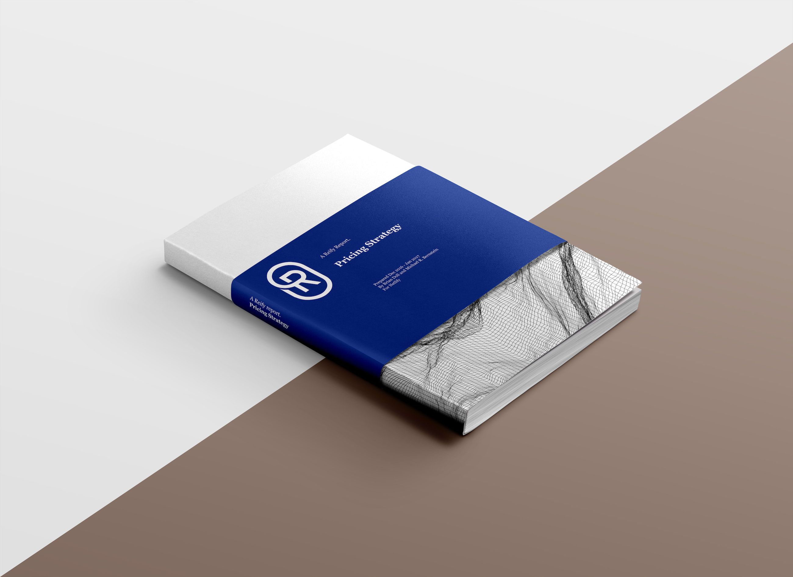
Applying the new concept to a physical object to help communicate the brand direction.
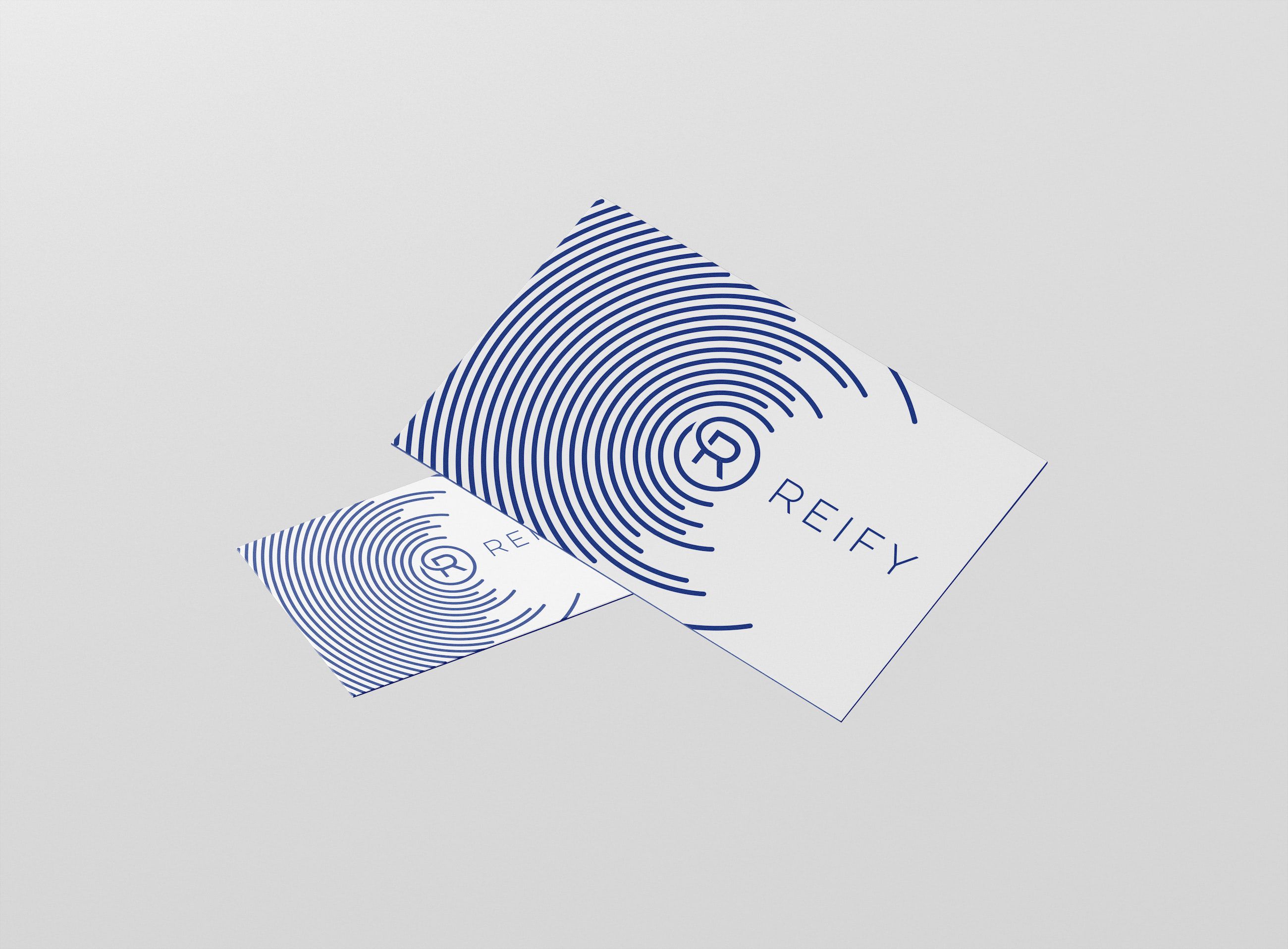
Business card mockup.
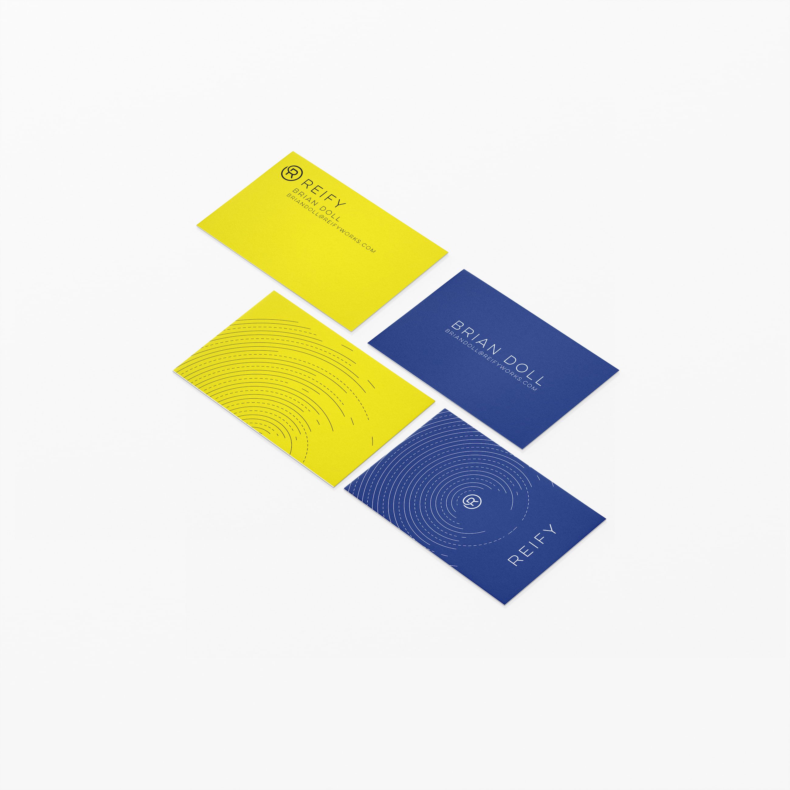
Blue and yellow brand directions executed.
The solution to the color problem was actually simple, go to the opposite side of the color wheel - Yellow. Everyone got excited again but felt the R inside the circle was not quite what they had in mind. Not exciting enough? Probably. From a designers perspective, it was clear any other mark that leaned more abstract was not going to be successful. I went back to reimagine more abstract solutions - expectedly none of them really worked.
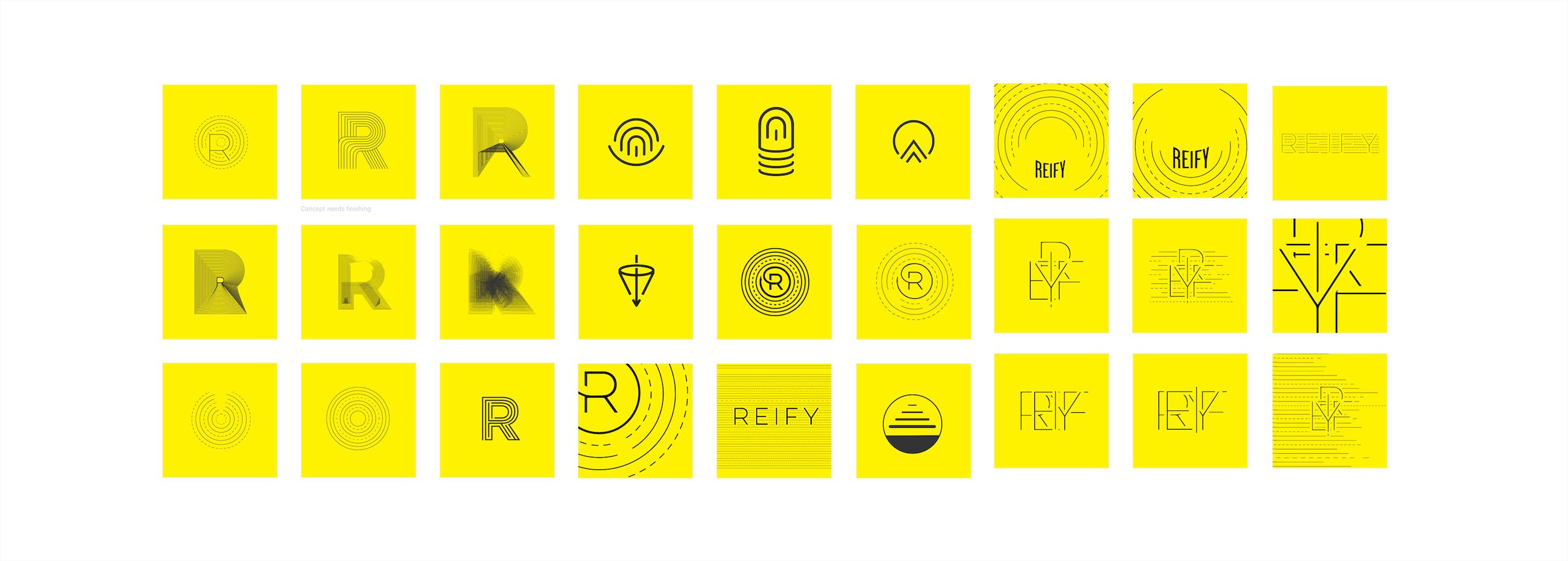
Alternative abstract concepts for the brand mark.
I decided to let them live with the final product for a week by creating iOS background screens with their logo on it. After the trial, they came back agreeing that R inside the circle was the most successful and off we went to finalize the brand guidelines.
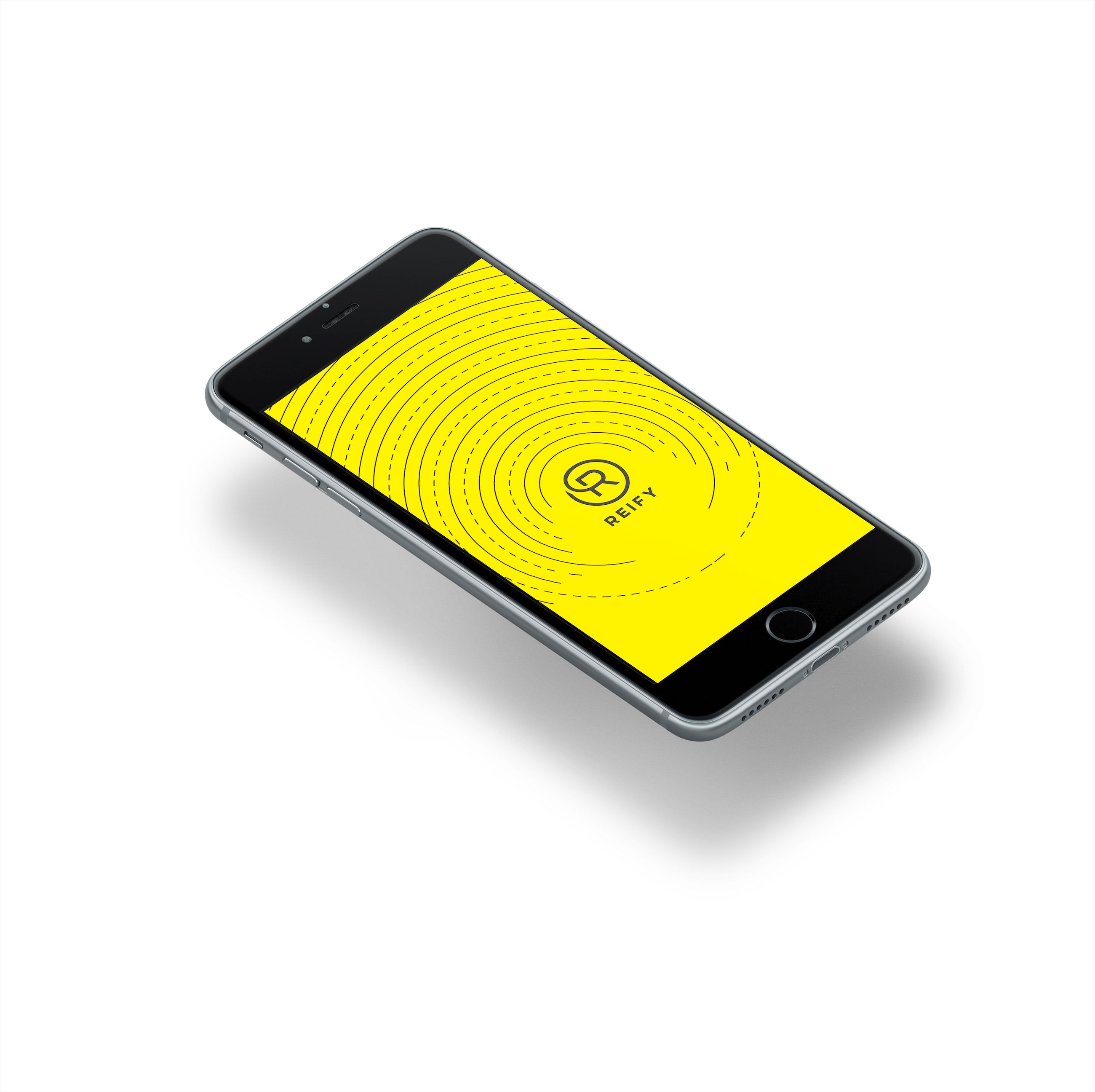
Creating a branded iPhone background.
Reify’s design solution brought the "abstract to concrete” idea to life. Exactly what Mike and Brian were looking for. And not only did they leave with a cool new logo, they left with an innovative brand image that sets Reify apart from competition in the B2B marketing industry.

The complete Reify brand guide.
In various contexts, it's important to keep the Brand tag unchanged to ensure consistency and brand recognition.


