Contextualizing Developer Insights
Improve understanding, at a glance, how well your technology team is doing.
Published Nov 20, 2021
Author Austin Barto
In the age of a blooming amount of development teams, contextualizing what engineers are doing in their day-to-day is becoming increasingly important. We're currently redesigning a product for Code Climate under the simple principle that good communication is the key to understanding problems better. Although littered with helpful information and valuable data, the current app has difficulty communicating upfront about what the data means. This lack of communication creates barriers between the knowledge and the people who need to understand it most.
Before we understood the contextualization problem, we decided to chase this idea of a ranking system for coders. For that, we researched how the best apps in the world award different accolades to their users - this meant games! For a while now, video games have had ranking systems put in place to give the user something to work towards, receiving different awards and accolades along the way to track progress. These systems provide the user something to engage with and experience as they interact and keep coming back when they're not playing -the reason video games are so popular today.
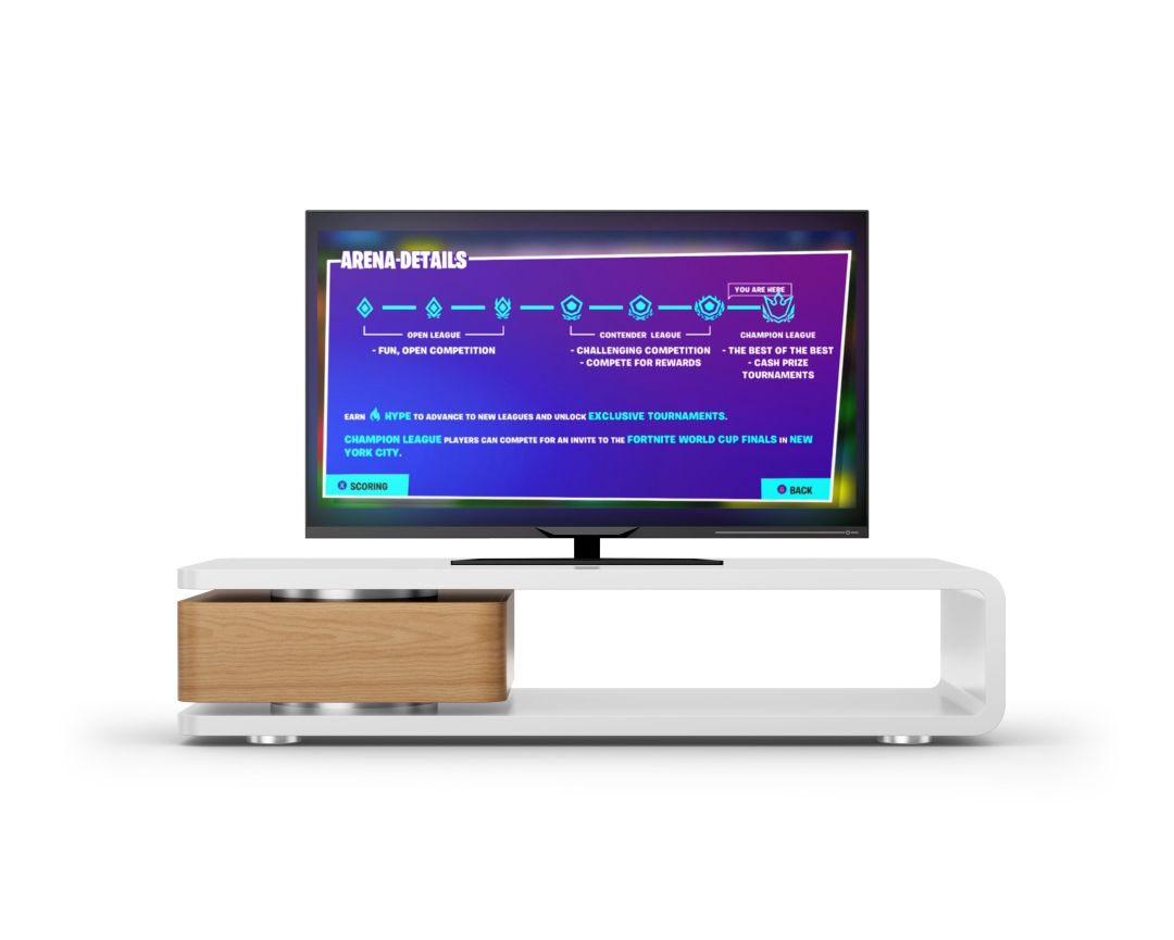
We wanted to see if we could mold this into what Code Climate was trying to accomplish with their users. Fortnite Competitive works on a 3-tier system: open league, contender's league, and champions league. Reaching the next tier involves earning points based on performance in-game, each harder than the last. Games like Modern Warfare 2 record particular merits attained while playing, for example, matches with zero deaths. Over time you could see how many times you have played with zero fatalities and compare that stat line to other players and friends.

Ranking system diagram.

Breaking down the concept of seasons.
The idea was that Code Climate could implement a system of its own where awards received by coders for their performance would count towards a rank, creating a competitive environment amongst development teams.
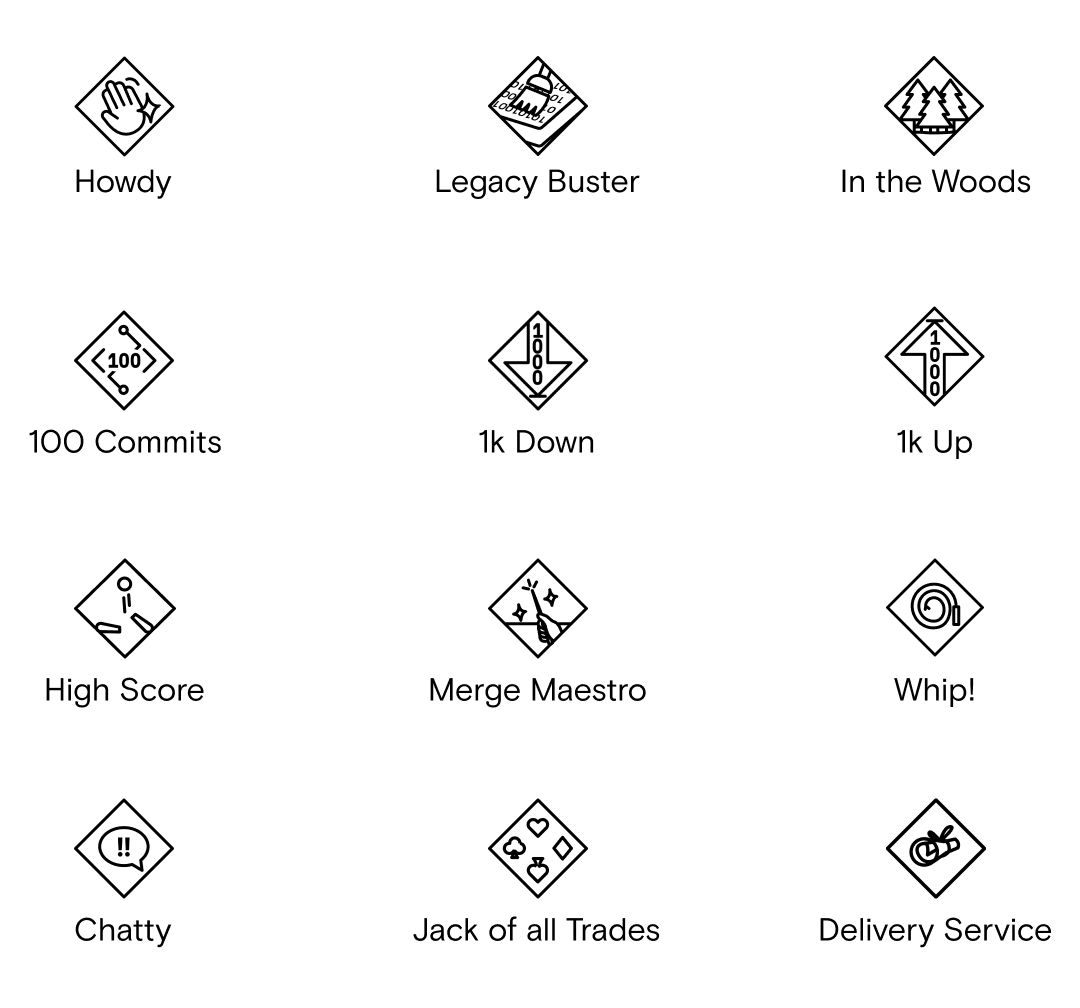
We also started to build out different accolades users could potentially receive. Code Climate already measures how many commits engineers author, so why not give a milestone award when a person reaches a hundred commits, a thousand, and so on? Or an award for when someone touches legacy code that is over a year old? We wanted to story-tell all these great metrics that Code Climate keeps insightfully, using a proven method. We created a handful of accolades we thought could be used, gave them believable names and icons, and wrote quick blurbs the user might read when receiving one.
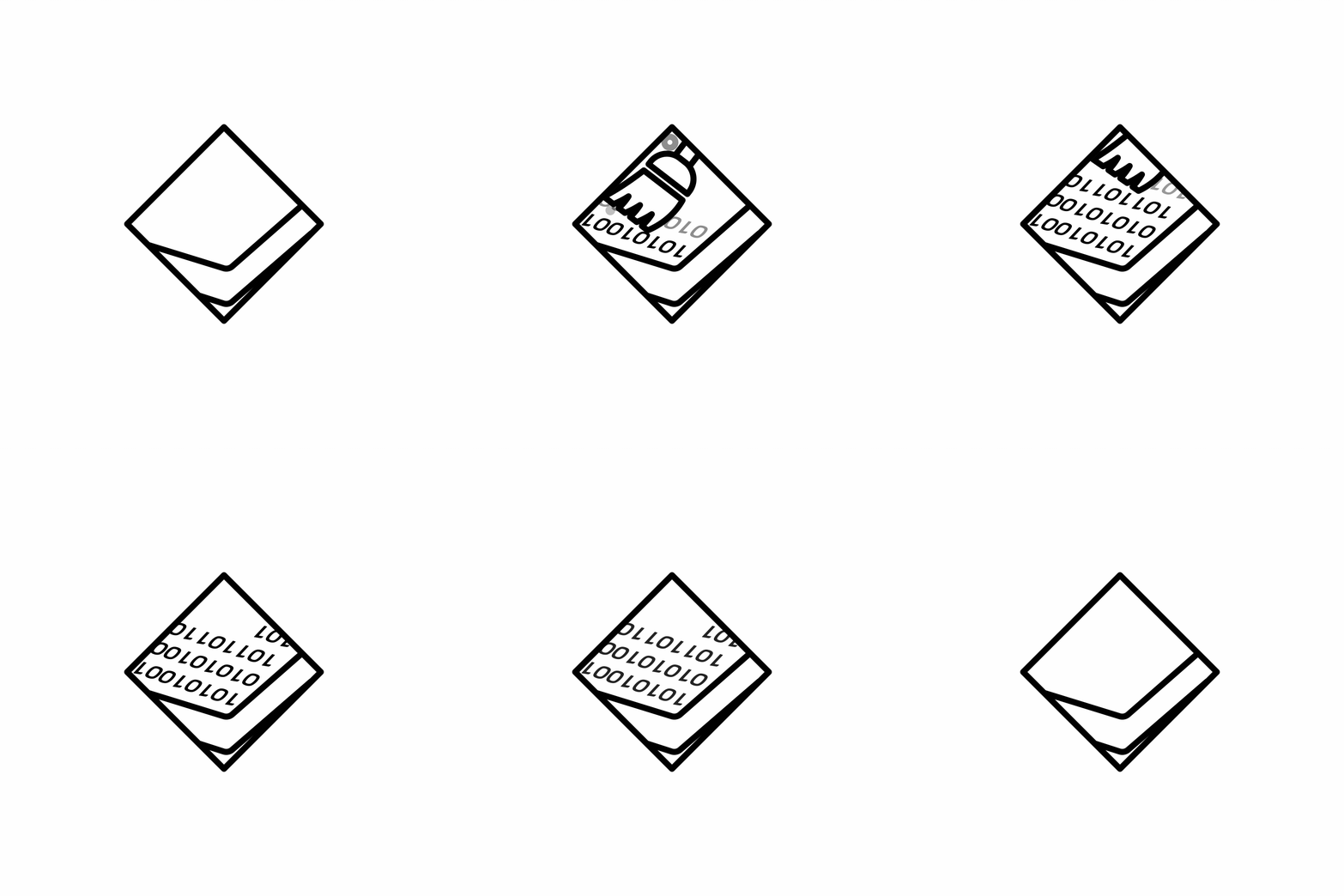
Legacy buster accolade animation example.
With such a complicated system to implement into an existing app, we decided to build a mood logic tree to help us contextualize insights Code Climate already measured on their overview page.
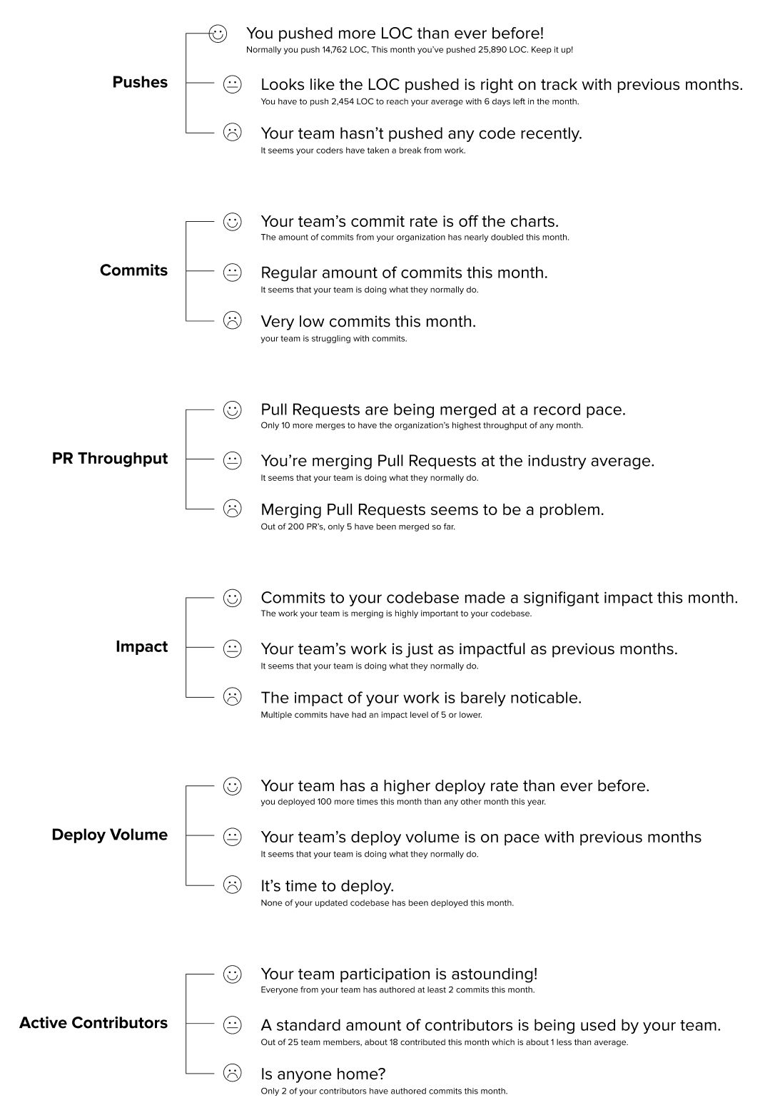
Mood tree diagram.
We had to understand the current data space. Code Climate already tracks stats like 'Pushes' (lines of code pushed), but unless you dig through the given data yourself, it's hard to understand at a glance exactly how well your team is pushing lines of code. Our solution - tell the user how they're performing using words. "You pushed more lines of code than ever before" is only one sentence yet gives excellent insight into how your team is doing at a glance. Users could then use the graphs to delve deeper into that insight and understand how it correlates to the data shown. We built out positive, neutral, and negative insight moods for each measurement Code Climate provided.
Implementing our logic to the design was now the clear path. So, we started redesigning the overview page using the current visual identity we had been trying on. Through only a few iterations, the colors we used for previous designs became too limiting. We decided that we'll go brutalist in style with the lack of current design capacity using these purples.
Strip away the colors to focus on functionality and fidelity. We got the colors toned out, and the graph/timeline style polished and found ourselves with this neutral blue, gray, and red design that story-told the data as you scrolled.
Narrowing the margins by stacking the information and stripping away more color, eventually, we landed on this final overview page for Code Climate.
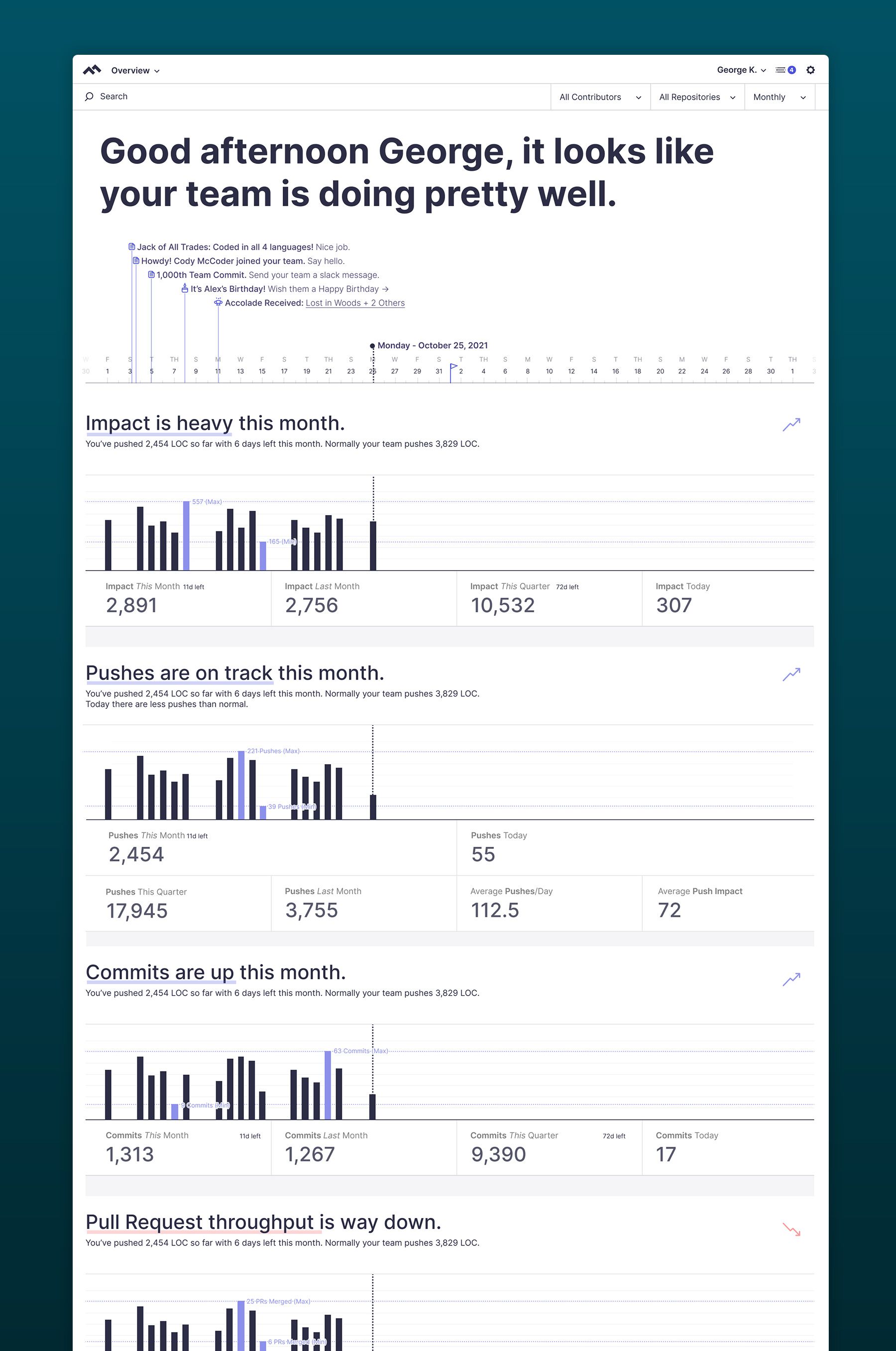
Overview page mockup.
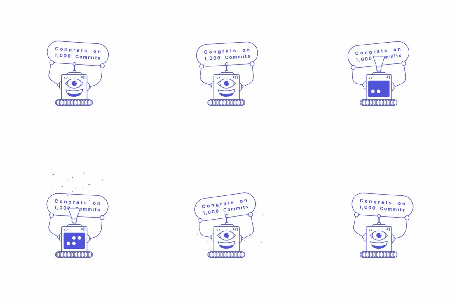
Celebration robot animation to improve the mood!
In this example, we replace the 'Product' tag with the 'Brand' tag, and combine 'UI' and 'UX' tags into a single 'UI UX' tag.


