Palm Booch Can Rendering
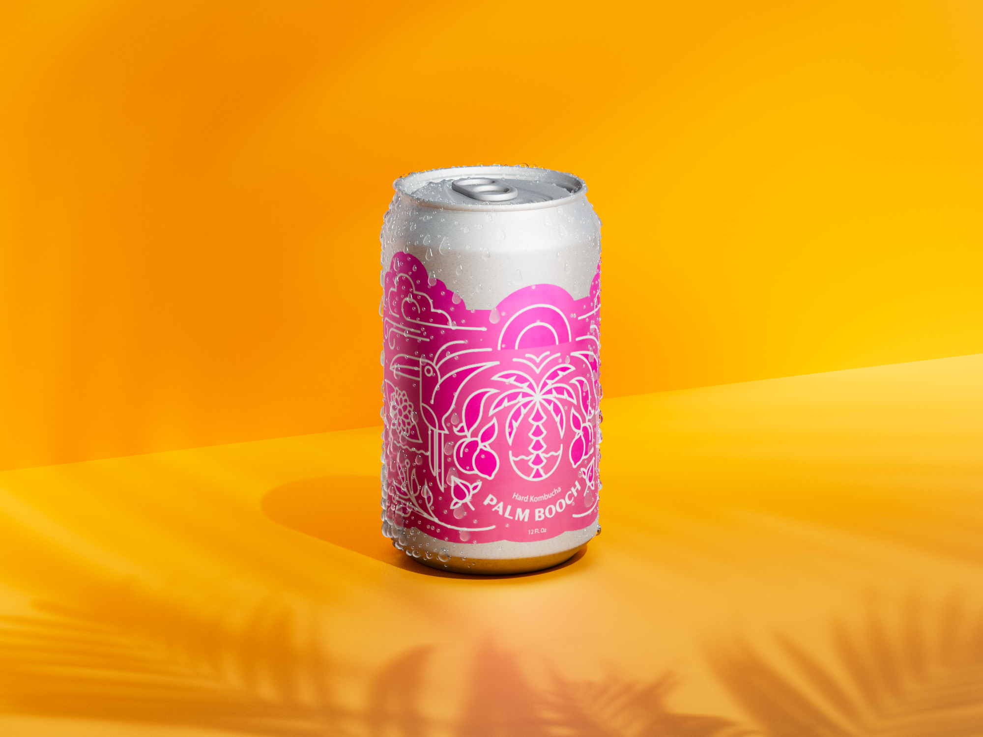
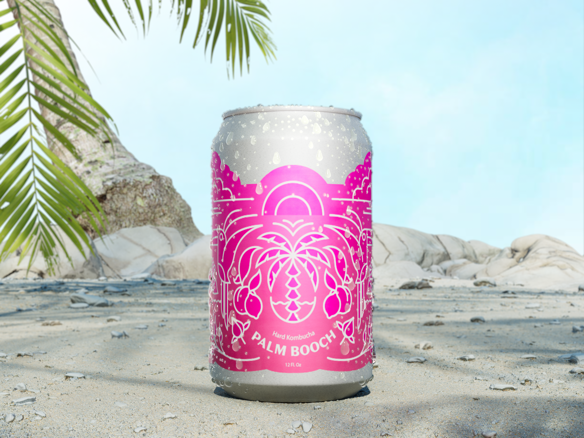
Palm Booch’s new watermelon hard kombucha features a vibrant label with toucans, flowers, and palm trees.
Published Aug 1, 2024
Author Steve Berry

We’re excited to share the next chapter in our journey with this refreshing hard kombucha brand. When Palmer first started brewing her own hard kombucha, the goal was simple: create a drink that embodies the carefree spirit of summer.
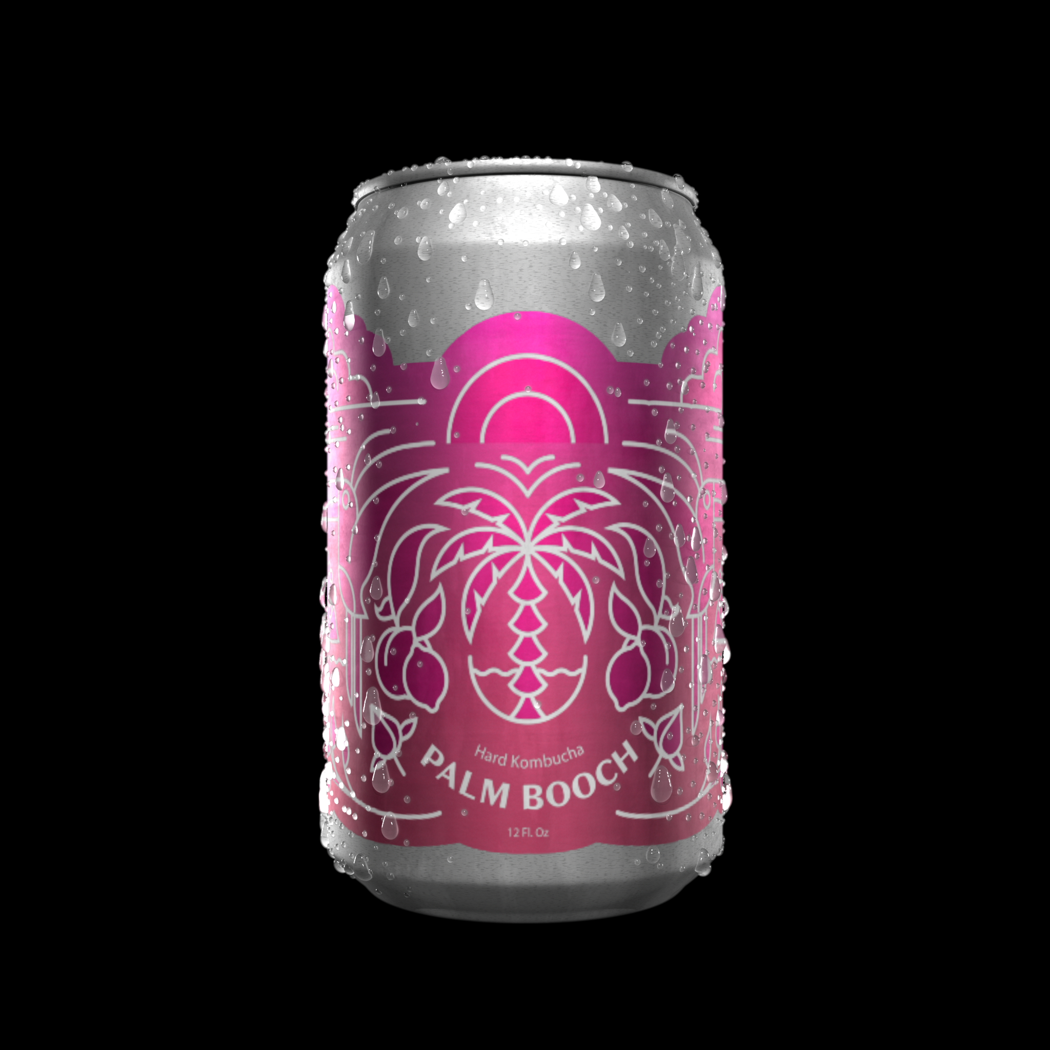
We had a lot of fun designing the label for this flavor, drawing inspiration from the playful energy of summer. A 12-ounce can adorned with toucans, flowers, palm trees, and a radiant sun, all set against a magenta gradient background. It’s an invitation to relax.
We created a design that looks great on the shelf and evokes the feeling of sipping a refreshing drink with friends, whether at the beach or lounging on your back patio. Playful imagery and bright colors are meant to transport you to those warm, sunny days, making every sip of Palm Booch’s watermelon hard kombucha a mini vacation in a can.


Initial first pass render. Figuring out the drops.
To replace all instances of the Product tag with the Brand tag, ensure that the Brand tag remains unchanged throughout the document.


