The UI reflects the tasks you ask of your user.
Designing user interfaces for complicated systems.
Published Jul 16, 2024
Author Steve Berry

In my consulting role, I often encounter the challenge of designing user interfaces for applications that handle complex tasks. Clients frequently react to these interfaces by saying, "This looks too complicated. It needs to be simpler." If you want a more straightforward interface, you must simplify what you're asking the user to do.
Consider the control room of the Chornobyl nuclear power plant. Those old images show a plethora of switches, dials, and displays. It's an elaborate, sophisticated interface because the tasks it supports are complex. Similarly, look into the cockpit of a modern airplane. The cockpit UI has to manage hundreds, if not thousands, of possible workflows.
In the consulting realm, it's clear that only some understand this relationship between complexity and interface design. There's a missed opportunity here. Instead of just simplifying the interface, we should take the time to simplify the workflow. By streamlining the tasks the user needs to perform, we reduce the inherent complexity of the designed interface.
Yes, occasionally, you develop an exquisite, convenient solution for a complex workflow. That's like pulling magic out of a hat, and it happens exceedingly rarely. I have another article about creating magic in practice if you're interested.
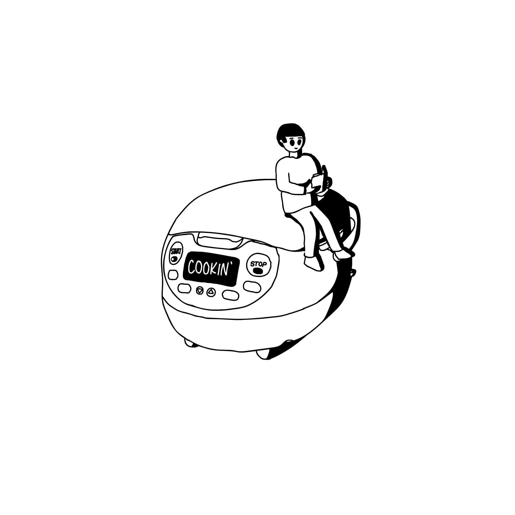
The modest rice cooker is one of the most compelling examples of a simple workflow interface. Think about it: a $12 dorm room appliance with a single switch. You add water, add the rice, and push the button. The light goes on, and when the rice is done, the light goes off, and the switch pops up. There's only one interface element because there's only one task: start cooking rice. The simplicity of this design is a direct result of the simplicity of the workflow it supports.
If you are looking for a fancy rice cooker, look at the Neuro Fuzzy Rice Cooker. It'll make the best rice of your life every time, while the UI is only slightly offensive. It sings you twinkle twinkle little star every time you start it, which is delightful. If you are at this stage of rice cooking, the workflow for cooking rice has expanded, and at times dramatically.
The moral of the story is to consider the decisions you can make on your customer's behalf. If you can make more decisions for them, your UI will become simpler. Simplifying complexity in design isn't just about reducing the number of buttons or dials; it's about understanding the workflow and making it as straightforward as possible. By doing so, you create an interface that is easier to use and more effective at supporting the tasks it needs to perform.


