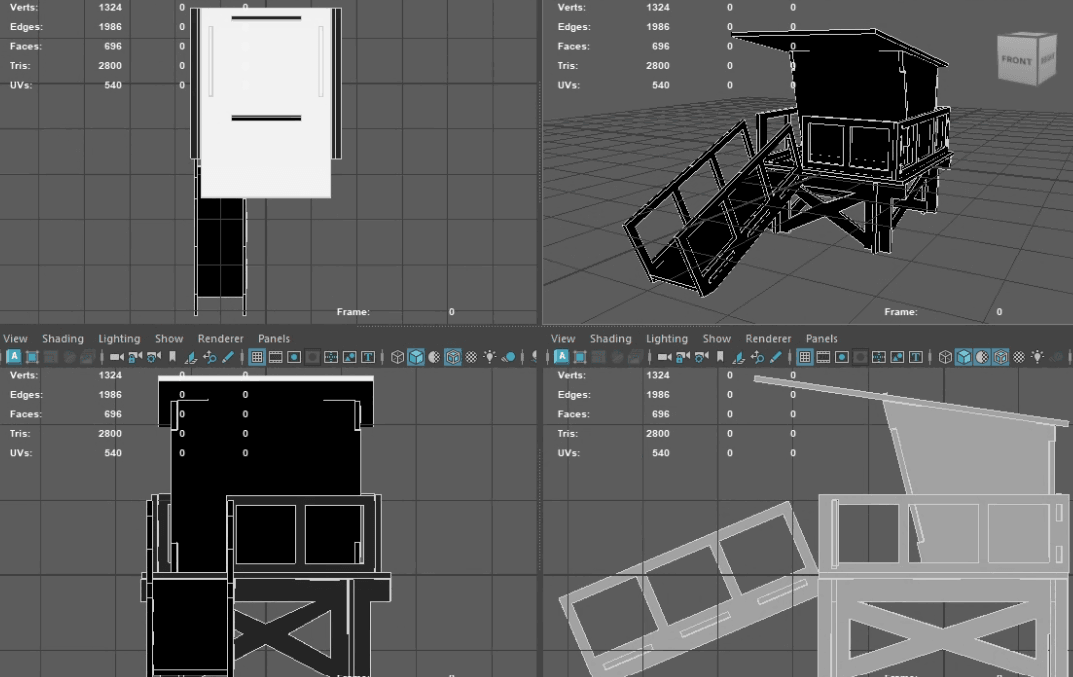
Lifeguard tower render.

Looking at this image from a Thought Merchants perspective, the design perfectly embodies our ethos of simplicity, functionality, and clarity of form. The 3D model appears to represent an architectural or product design with straightforward yet robust geometry—a direct reflection of our approach to blending utility with aesthetics.
The grid views and wireframe renderings highlight the technical precision we value in iterative, resilient design. Every component, from the staircase to the structural supports, is laid out with clear intention. There’s a strong emphasis on balance—both visual and structural—pointing to a design that’s built to serve its environment, whether it’s a public or industrial space.
Aligned with our incremental build philosophy, this model prioritizes usability before adding unnecessary flair. Each panel, edge, and vertex reinforces the product’s core function, adhering to our belief that simplicity and clear communication are essential in any design process.
The rawness of the wireframe, the exposed skeletal form, speaks to our belief that even in the early stages of development, a design should communicate its purpose. This feels like a first iteration, where usability comes before polish—reflecting our process of building functional experiences before evolving them into more emotional and persuasive ones.
As for materiality and future textures, the clean, straightforward surfaces invite customization while maintaining the “form follows function” philosophy. In its raw form, this image showcases how our designs evolve: they begin with practicality and grow in sophistication as needed, staying true to the core ethos of Thought Merchants—simplicity, clarity, and iterative growth.