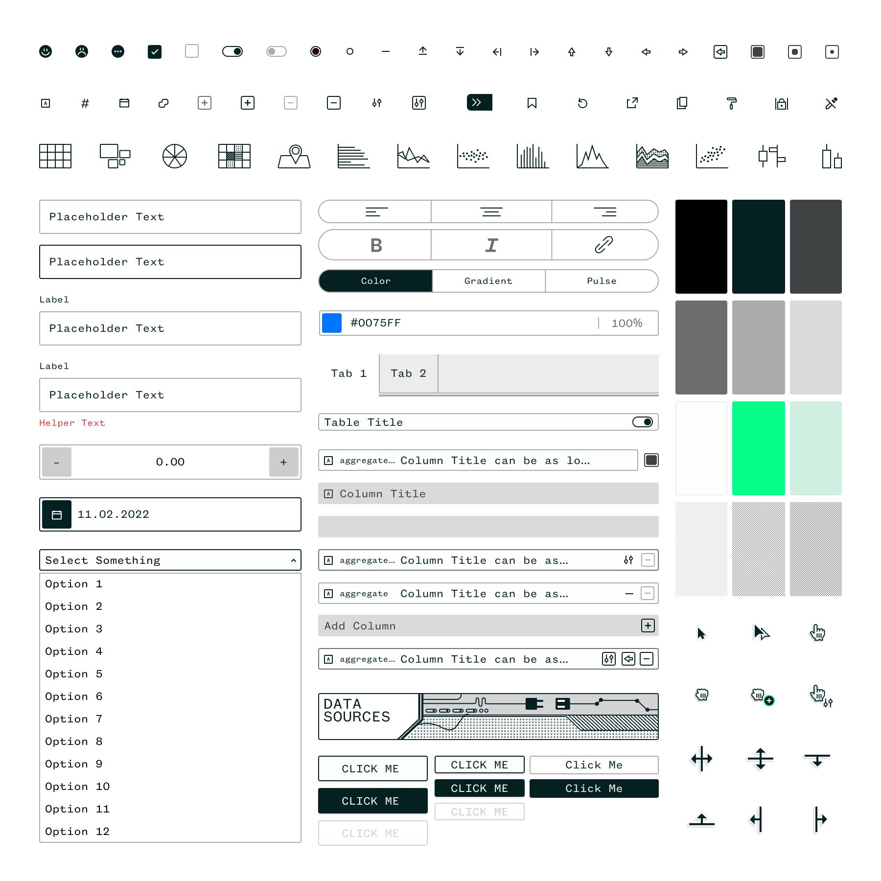
User Interface Organized Neatly
A design system for Prospective.
Published Jan 13, 2023
Author Austin Barto

We wanted the interface to be minimal regarding color to allow the visualizations to shine. The use of pattern and high contrast is reminiscent of old 8-bit console screens like the Gameboy or the newer Playdate handheld that we love.
Who doesn't love a neatly organized UI grid?
In this example, we demonstrate how to handle tag replacements effectively. The Brand tag is retained, and both UI and UX tags are combined into a new tag named UI UX.
DirectionSteve Berry
DesignAustin Barto


