Wet Ties
Dress the waves you want, not the waves you have.
Published Jan 12, 2022
Author Austin Barto
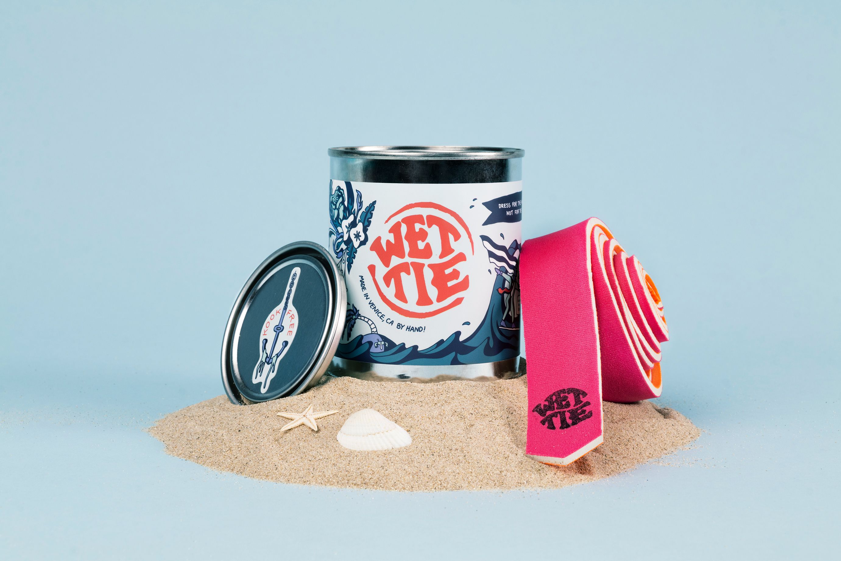
Earlier this year, Steve came to me with an amazingly peculiar idea he and a friend created as sort of this joke between them - a formal dress tie made out of wetsuit material (you know, like the kind you surf in). He gave me a prototype tie he created and the phrase “Dress for the waves you want, not the waves you have.” From there, Wet Tie, as a fully designed and packaged brand, was born. This idea of creating a solid visual brand around a relatively frivolous product intrigued us. The thinking was that if we built a brand strong enough, the outcome would be inherently more fun.
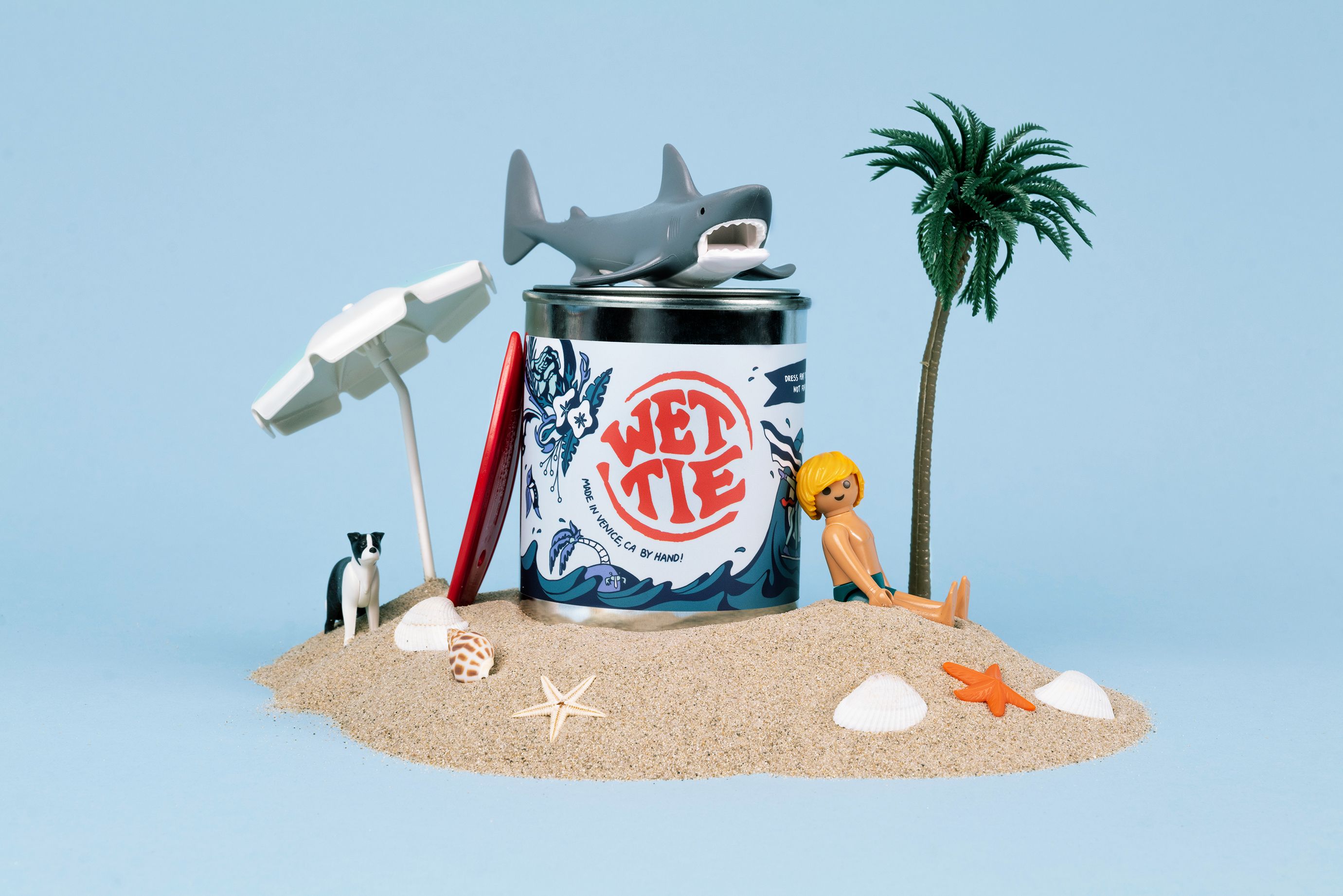
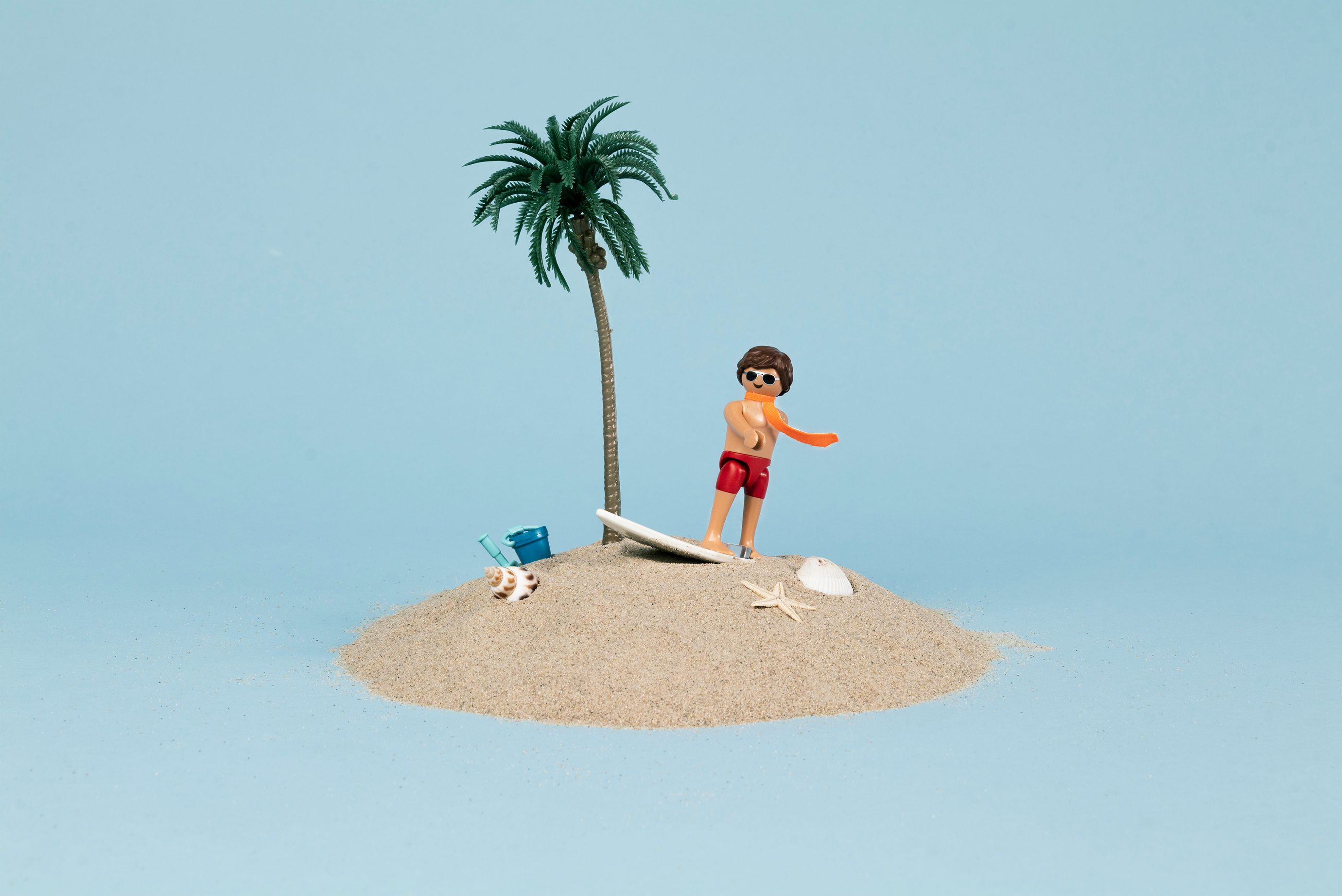
So I bogeyed off to my desk and started to sketch. We liked the idea that, since this product is going to be made entirely by us, it should be reflected in the style of Wet Tie. A hand-sketched feel was going to be perfect for this. The first sketches I did were just for the logo lockup. We weren’t sure if it would be called Wet Tie or not, so we were essentially trying that on. We loved it!
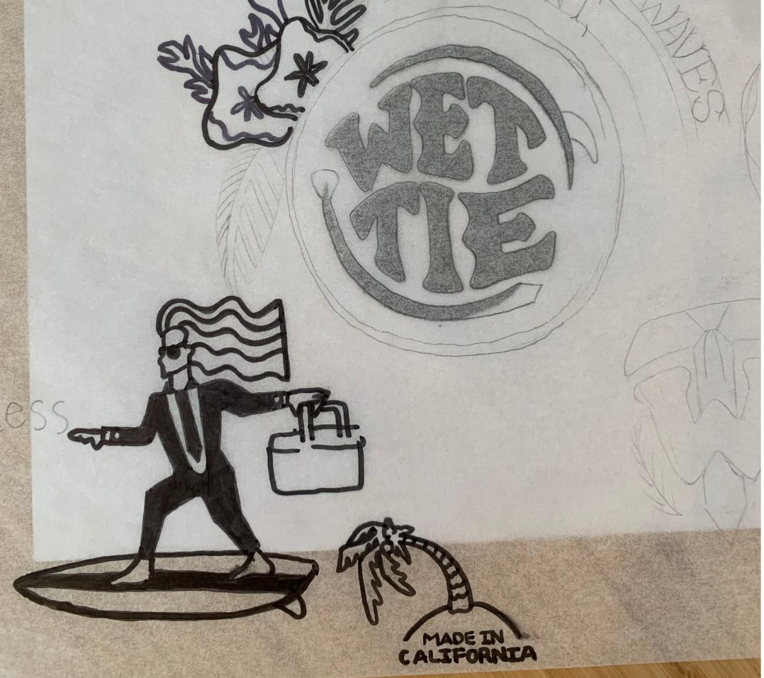
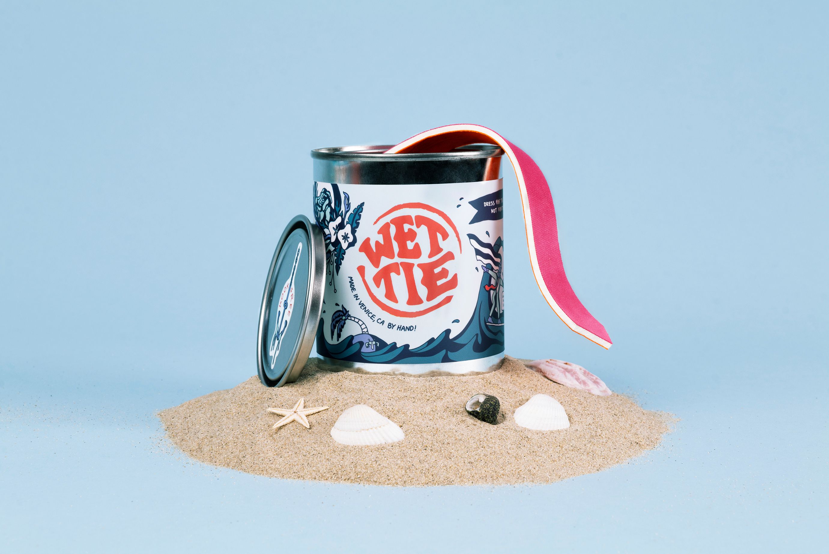
After sketching and refining this mark, we landed on a lockup we liked. The type was solid on its own, but we added surrounding elements based on waves and a tie to really tie it together. Making the logo more circular and full. At the same time, we found these mini paint cans perfect to package the ties in with just barely enough room.
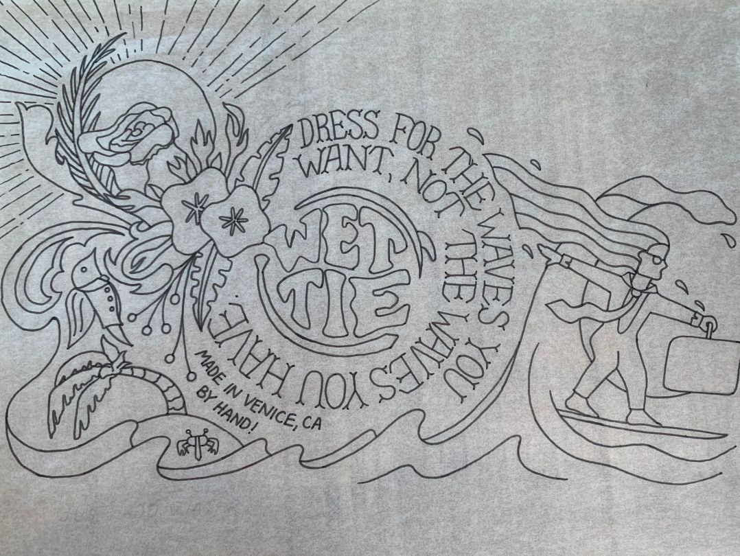
Original drawing of packaging label
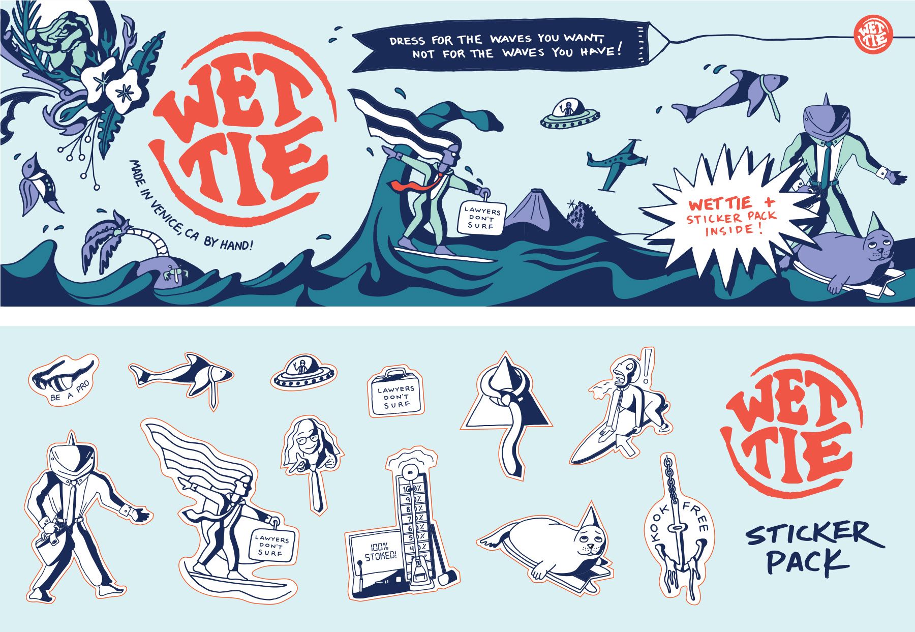
We took the logo mark and slowly built out an illustration behind it. This was going to be the basis for our packaging label down the road; in fact, most of what was drawn here was kept somehow.
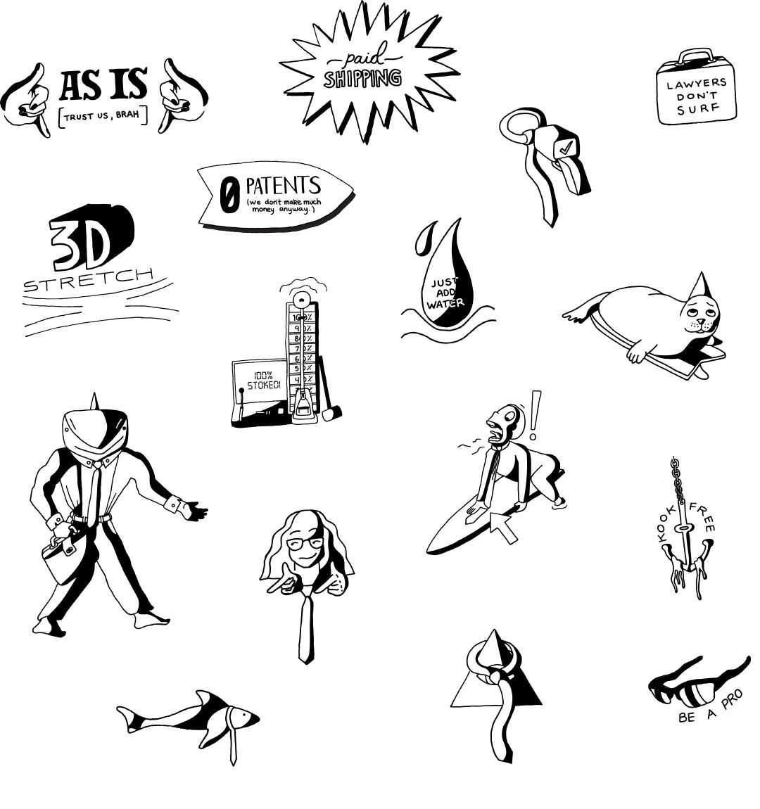
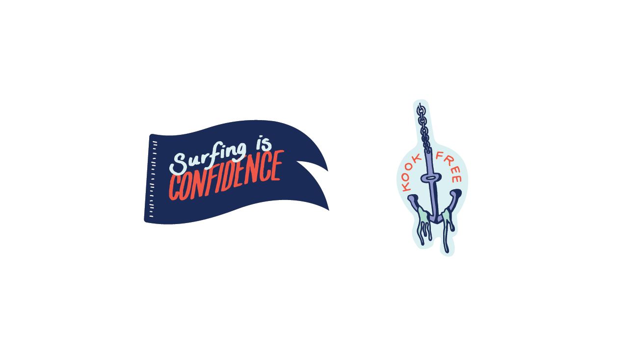
With a finished logo and a decision on the packaging - we found ourselves asking what’s next? We weren’t sure about the feel of the brand and what that would look like, so we imagined a marketing page for Wet Ties. Phrases like “Zero patents, we’re not making much money anyway” and “Lawyers Don’t Surf” helped us paint the picture of how the brand was going to act, sound, feel, etc. We made a whole list of these with corresponding illustrations, further emphasizing the brand and helping us visualize.
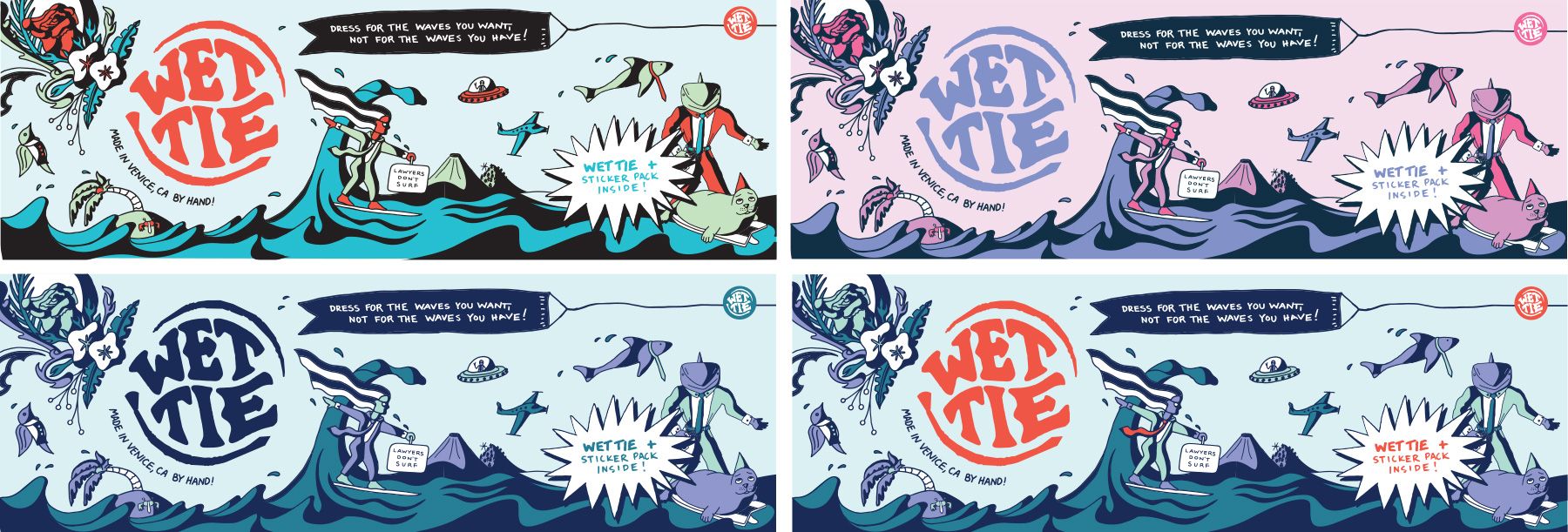
Adding the newer illustrations and the brand character’s to the original scene created the illusion that you were in this world of Wet Tie where the Business Shark and Surf Lawyer lived, making for an excellent packaging experience that spoke to what the brand was - a way to have fun. Eventually, landing a color-way that we liked, it was time to send our designs to the press to be printed.
In this article, we will keep the Brand and Process tags, replace the Illustration tag with the Art tag, and replace the Photo tag with the Photography tag.


